★★★★★
Tinton's ability to translate complex business requirements into intuitive, accessible experiences is exceptional. He doesn't just design screens, he architects outcomes.
Senior UX Manager and Principal UX Designer with 17+ years of leadership experience across India and the UK. I translate complex business challenges into measurable, human-centred outcomes.

Strategy before pixels. I lead design teams to ask the right question before designing the right answer.
My practice centres on aligning design systems with business roadmaps, empowering cross-functional teams, and building a measurable design culture, where every UX decision is tied to a business outcome.
Every design decision mapped to OKRs and business KPIs, so every pixel earns its place.
Bridging product, engineering, and research to create shared ownership of UX.
Every project closes with hard data: adoption rates, time savings, or revenue impact.
Mentoring juniors into senior roles through structured rubrics and career frameworks.
Reflections from product leaders, engineering managers, and clients I've partnered with across three continents.
Tinton's ability to translate complex business requirements into intuitive, accessible experiences is exceptional. He doesn't just design screens, he architects outcomes.
Leading a cross-vendor team is never easy, but Tinton brought clarity and vision. The Design for Delight approach genuinely transformed our digital health experience at Boots.
Tinton is that rare UX leader who speaks both design and business fluently. His analytics dashboard UX at AXA XL gave our underwriters a real competitive edge.
Open to Senior UX Manager, Principal Designer, and Head of Design opportunities, plus advisory engagements.
Structured using the Minto Pyramid: lead with the outcome, then unpack the context, strategy, and execution.
Partnered with Intuit UX leadership to guide my team in scaling an agentic UX framework from Intuit Assist in QuickBooks to the enterprise products — establishing trust, control, and transparency patterns that allowed finance teams to delegate multi-step workflows with full oversight.
In partnership with Intuit UX leadership, I coached my team to adopt Vibe Designing — an AI-native framework using NotebookLM, Claude, and Figma AI to transform research and PRDs into traceable, dev-ready code rather than static mockups.
UX lead and project manager for Network Rail's Virtual Lineside Inspection platform: owned strategy, research, design direction and the release plan; managed three designers, two BAs and an SME across ten months; won the Digital Transformation Award 2023.
Led a three-person team through a six-month, deadline-bound redesign of MAPFRE's legacy Online Bind. Replaced a lengthy single-page form with a guided wizard, extended the brand system with WCAG AA components, and took usability-test completion to 100% error-free.
UX lead and design manager for Boots' personal-healthcare app strategy with the NHS: ran a double-diamond programme across research, service design and delivery, managed four designers and two researchers, and shipped WCAG 2.1 AA-compliant prescription, pharmacy-service and Health Hub journeys.
Lead Experience Strategist and design lead for KOKO's zero-to-one mobile app: owned strategy, research and design direction, ran stakeholder workshops, coordinated four developers across three releases, and shipped to Google Play with 10K+ downloads.
UX lead for a social decision-making app: owned the research plan, product strategy and design direction, ran the stakeholder pitch, and coached a BA and a visual designer through a lean, evidence-led sprint to a testable MVP.
Beyond wireframes: the systems, frameworks, and cultural tools that scale design organisations.
Unified component library across IES, PPM, and Compliance. 30% component reuse, 15% faster dev handoff.
Skills-based hiring rubric evaluating UX candidates across 5 competency levels, from IC to Principal.
Quarter-on-quarter capability assessment. 3 junior designers progressed to senior roles under this framework.
Institutionalised Intuit's Follow Me Home practice across 2 vendor orgs, integrated into sprint cycles.
WCAG 2.1 AA guide adopted across Boots' 3 digital product teams. 100% compliance for medical e-commerce.
Design-thinking workshop templates that cut project kickoff ambiguity and turnaround time by 30%.
Spanning FinTech, HealthTech, InsureTech, Government, and Defence sectors across India, the UK, and global clients.
One employer, five client engagements. Each role below was delivered on Cognizant’s behalf at the client’s site: four UX lead and manager roles in the UK, then the Principal UX role for Intuit in Bengaluru today.
17 years of honed capability across UX leadership, research, design systems, and cutting-edge tooling, including Agentic AI and XR.
A commitment to continuous learning, from classical usability methods to cutting-edge XR and AI design.
Perspectives on UX leadership, design strategy, accessibility, and AI-augmented design practice.
The shift from IC to UX manager is not a promotion, it's a role change. Here's how I learned to lead with outcomes instead of outputs.
How inattention, hyperactivity and impulsivity change the way people use an interface, and the inclusive-design principles, focus-and-clarity tactics and testing tips that help.
With Gen AI reshaping how products are built, what does it mean for the future of UX leadership? My take after earning the XR Design cert.
Accessibility is not a checklist, it's a design culture. How we achieved 100% WCAG compliance on Boots' healthcare platform.
A practical walkthrough of the maturity model framework I built at Intuit and how it created a culture of structured growth.
Why structuring your case studies with the result first wins stakeholder attention in the first 60 seconds.
The tactical decisions behind building a cross-platform design system for a safety-critical product under tight constraints.
Open to Senior UX Manager, Principal Designer, and Head of Design roles. Also available for advisory engagements and design leadership consulting.
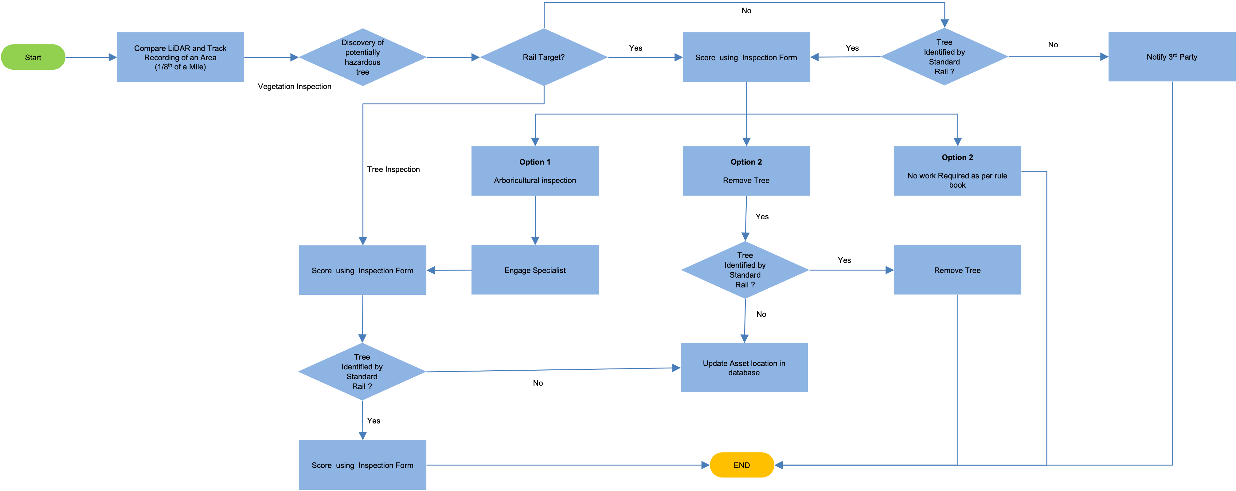
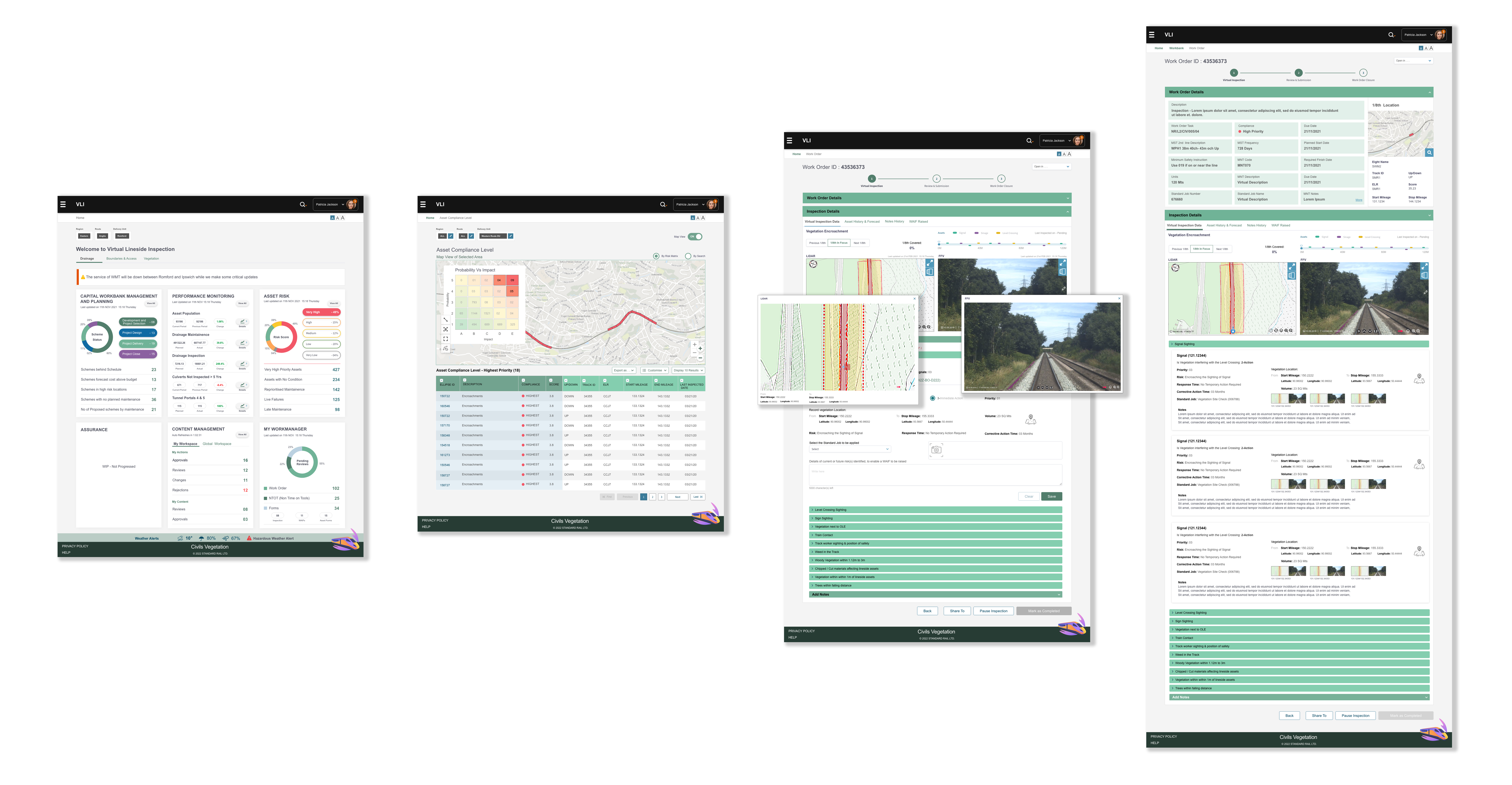
Virtual Lineside Inspection is a desktop platform that lets Network Rail engineers inspect track corridors for vegetation encroachment from the office, replacing hazardous physical surveys across a 20,000-mile network. I led the ten-month engagement as UX lead and project manager: set the strategy and research plan, directed a team of three designers, two business analysts and a subject-matter expert, ran stakeholder workshops and release governance, and delivered a platform that won the Digital Transformation Award 2023.
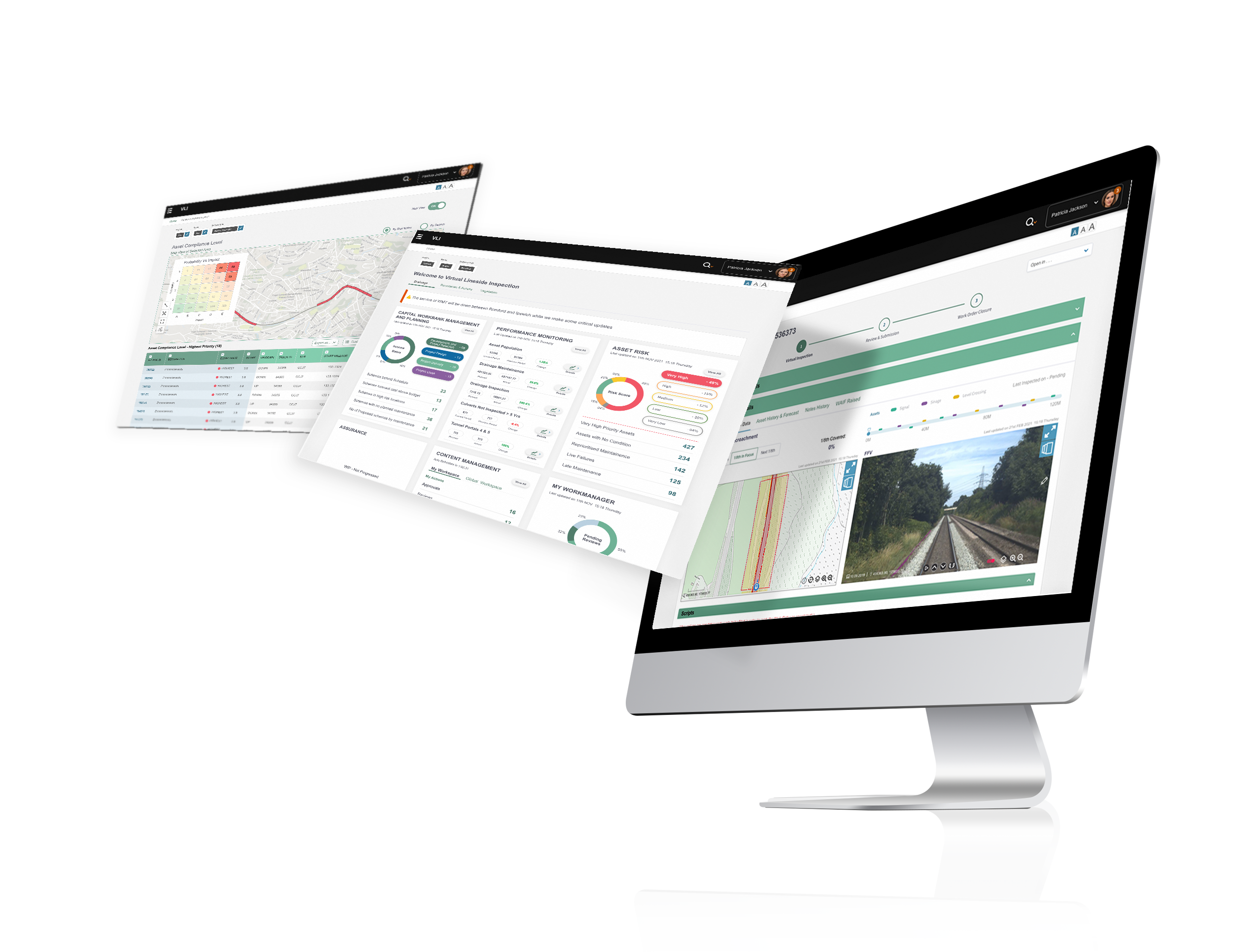
The brief was to envision a desktop application that would let railway inspection engineers carry out virtual checks on unmanned, remote stretches of track to monitor vegetation encroachment, all from the safety of an office environment.
The platform combines two data streams: LiDAR (Light Detection and Ranging) survey data of the physical site and forward-facing video footage recorded from the driver's cab of a passing train. Engineers can compare these two sources frame by frame, assess the level of encroachment at any milepost, and generate maintenance work orders, without leaving their desks.
A machine-learning layer highlights vegetation inside the inspection zone on the video feed and flags encroachment zones in the LiDAR view; based on the engineer's confirmation it recommends next actions and routes the work order to the right maintenance crew.


Vegetation creeping into the rail corridor is a persistent safety threat. It blocks the driver's line of sight, contributes to leaf-fall hazards in autumn, and can cause direct track obstructions if left unchecked. With more than 20,000 miles of track spanning the UK, physically walking every section was never going to be sustainable.
The existing process relied on on-foot engineers carrying handheld tablets, conducting periodic surveys, raising work orders, and then handing those over to maintenance crews. It was time-intensive, weather-dependent, and limited by network connectivity in remote areas.
The client needed a way to digitalise the inspection workflow — moving the eyes-on-track activity into an office environment, while keeping the rigour of a trained inspector's judgement at the centre of the process.
A safety-critical client, a regulated environment, six people across two vendors, and a ten-month programme. Leadership here meant building shared understanding early, protecting the team's focus from a long requirements list, and making every design decision defensible to engineers whose job is preventing derailments.
Set the ten-month plan, the MVP boundary and three prioritised releases; owned the UX budget and vendor resourcing.
Designed the discovery approach, led field visits with on-foot inspectors, and ran synthesis so the whole team owned the insights.
Facilitated workshops with SMEs, BAs and client leads; aligned two vendors on one process; ran demos and sign-offs each release.
Coached three designers through critique and pairing; set the design system and definition of done that let them work in parallel.
We opened the project with a structured series of workshops involving SMEs, business analysts, and key stakeholders. The goals were practical: surface tacit knowledge, expose current limitations, agree on priorities, and build consensus around an MVP scope.
To ground the team in real conditions, we organised field visits with on-foot inspectors. Walking alongside engineers as they ran live surveys gave us first-hand insight into the constraints of the existing process and what would need to translate into the digital experience.
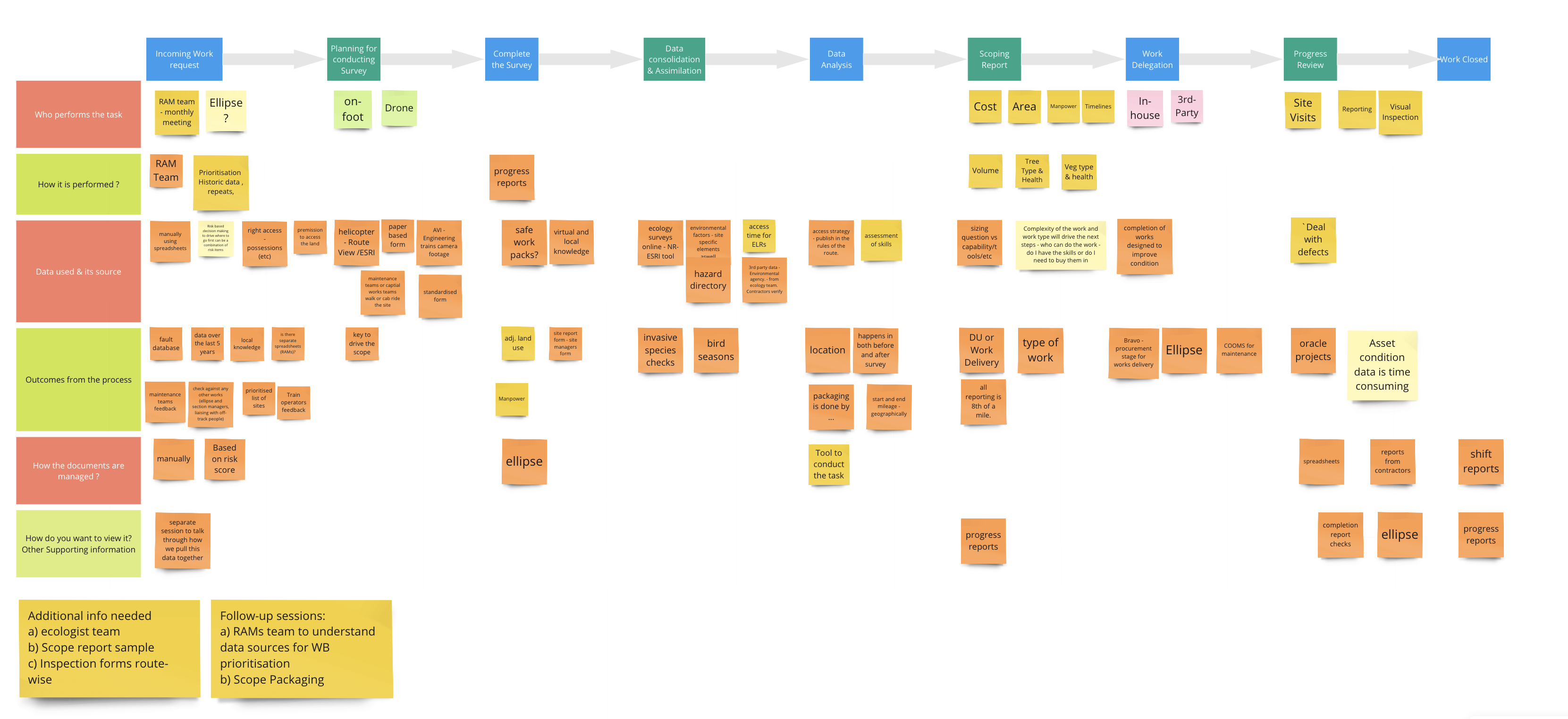
Synthesising workshop output, we organised the platform's requirements into three tiers, sorted by criticality. This gave the team a clear ranking for MVP scope and a shared vocabulary for trade-off conversations with stakeholders.
Designing for a data-heavy enterprise platform is closer to sculpting than illustrating. You start with an enormous block of available information and carve away until only what's useful for the task remains. Strip too much, and the tool becomes useless. Keep too much, and it becomes unworkable. The skill is in the balance.
From the workshop and field data we synthesised two distinct user personas, each with their own pain points, goals, and contextual constraints. These gave us a north star for every interaction decision that followed.
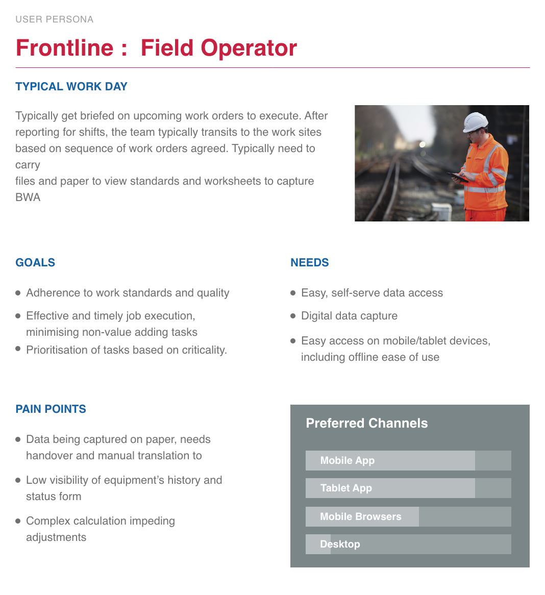
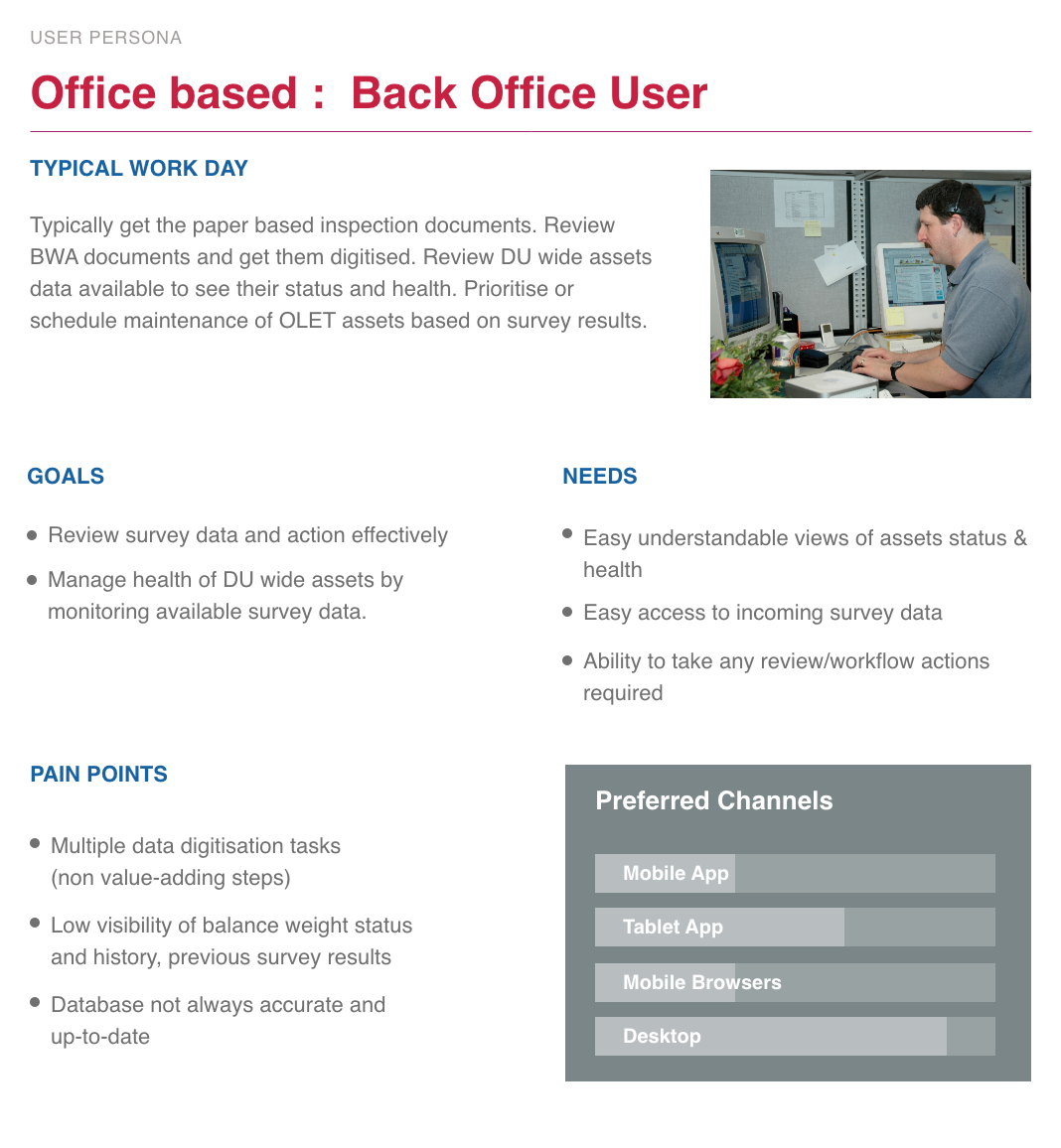
With personas in place, we mapped a pain-points and opportunities chart to anchor the ideation, then visualised the ideal task flow for each user group.
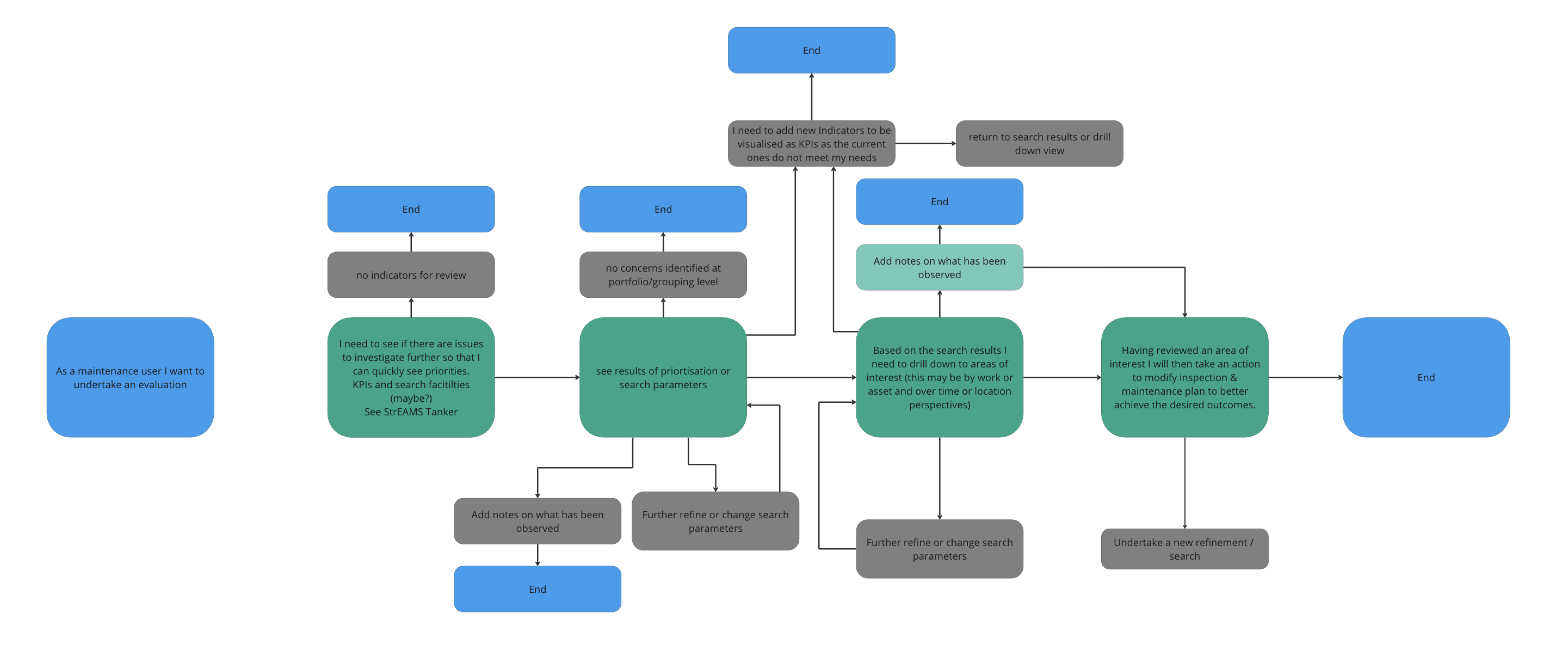
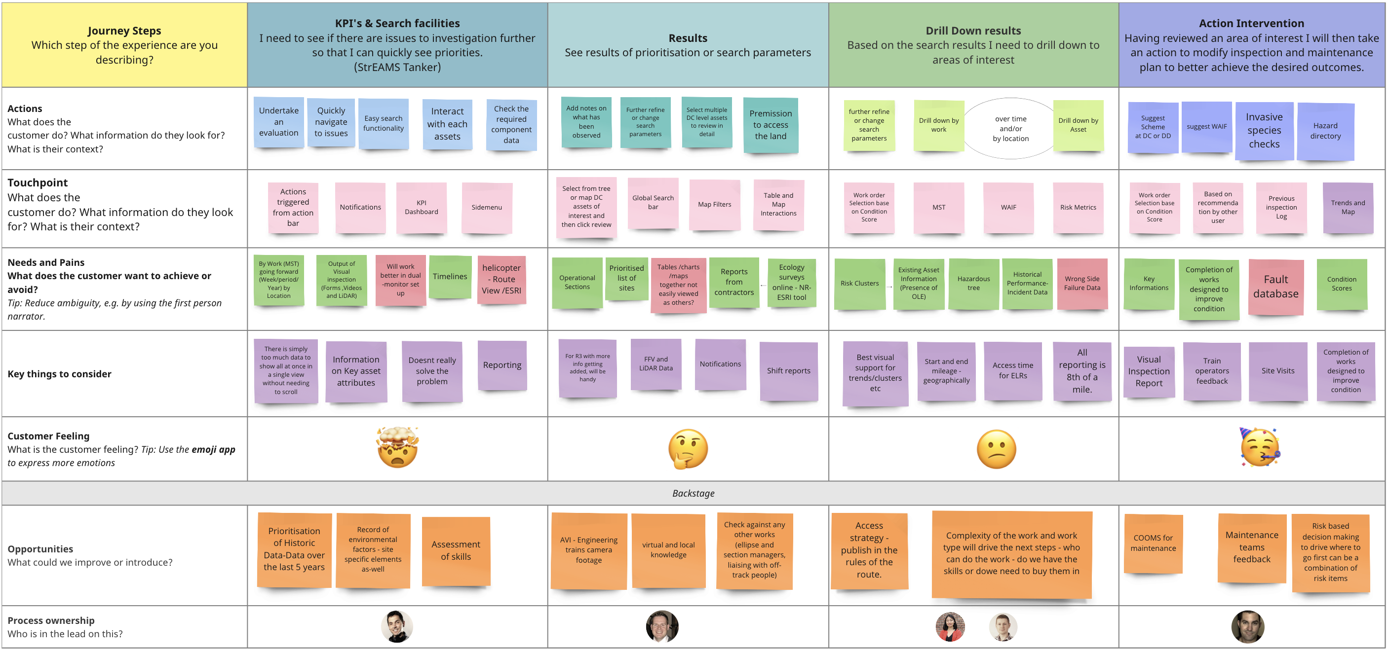
Explicit escalation path to Control, clear confidence indicators on ML recommendations, and audit trail on every work order.
Shared design library, shared definition of done and cross-review of each other's flows so the seams never showed to the user.
Involved inspectors from the first field visit through every usability round; their language, not ours, in the UI.
Progressive disclosure per milepost and one primary action per view; caught and tightened after round-one testing.
All design-library colour combinations were validated to AA–AAA contrast standards using third-party tooling, before any UI was committed to.
Text, buttons, and iconography were sized for clear legibility across every screen size the platform could be used on.
Prototypes were annotated against WCAG guidelines, exposing focus order and screen-reader traversal so engineering could implement faithfully.
Before committing to a final structure, we explored four candidate layouts. Each was assessed against the core constraint: showing dense, side-by-side LiDAR and video data without overloading the inspector's working canvas.
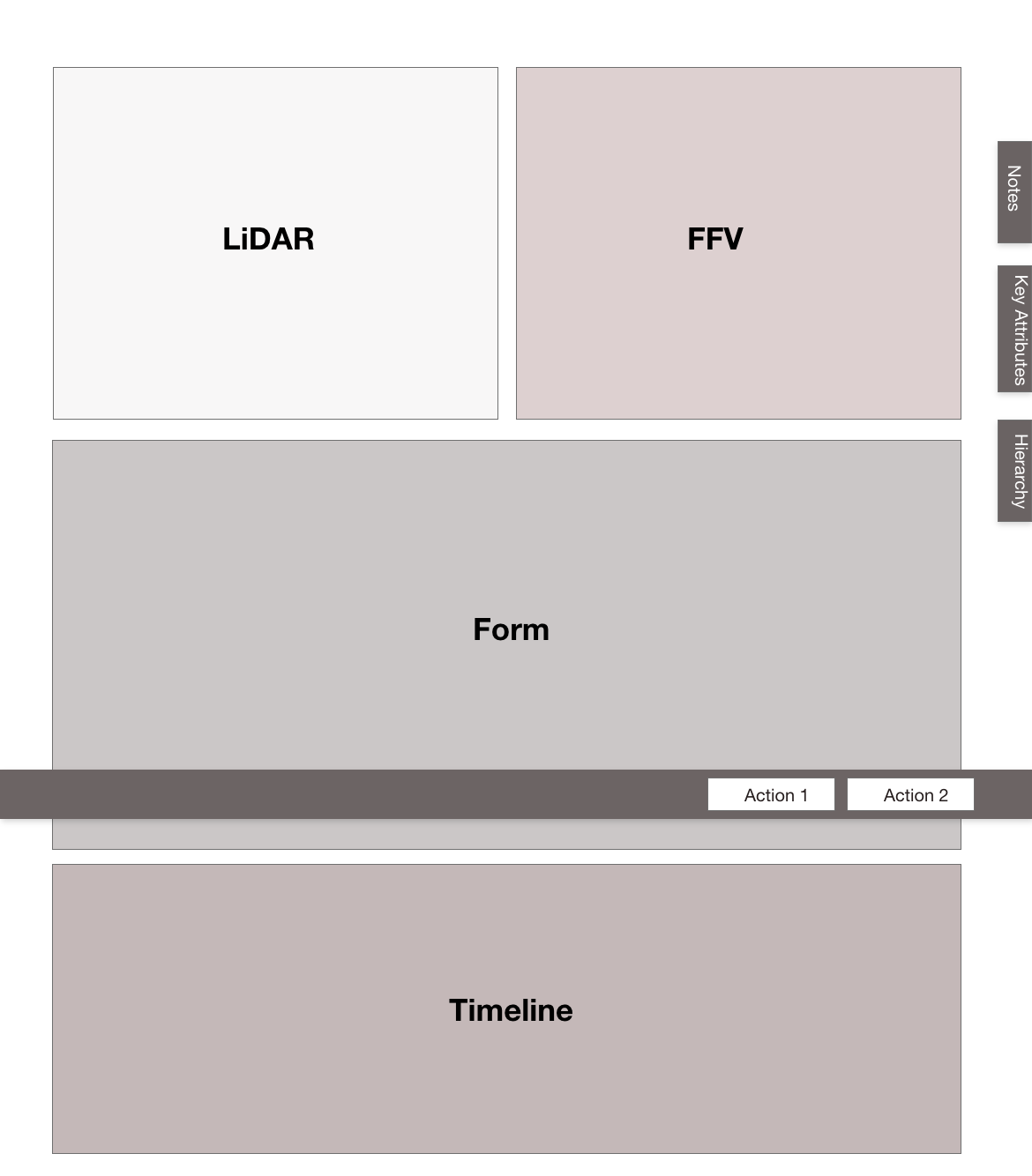
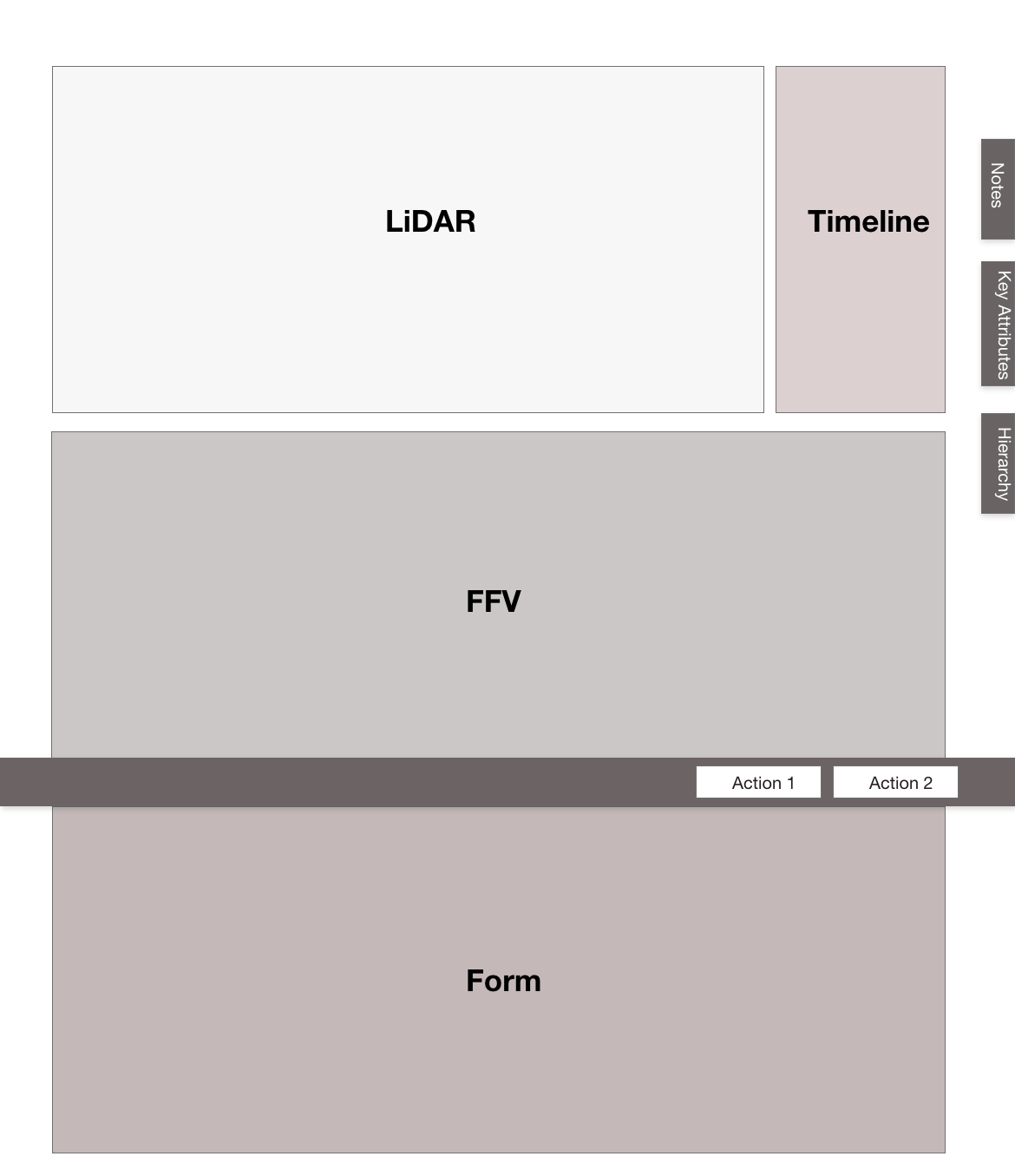
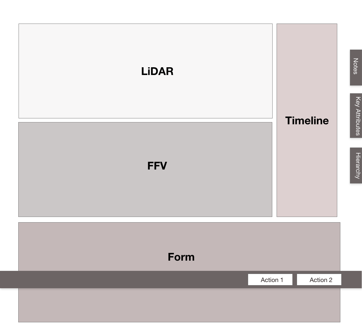
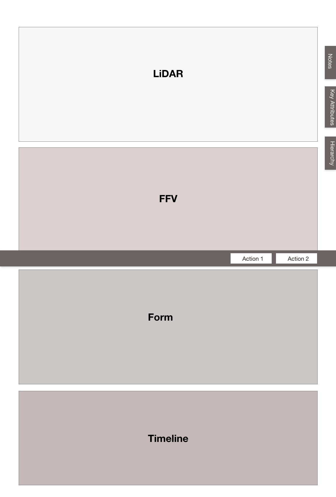
Once layout direction was set, I focused on key screens in low fidelity to test usability and scalability. The structure that emerged could absorb multiple user types and use cases without breaking down.
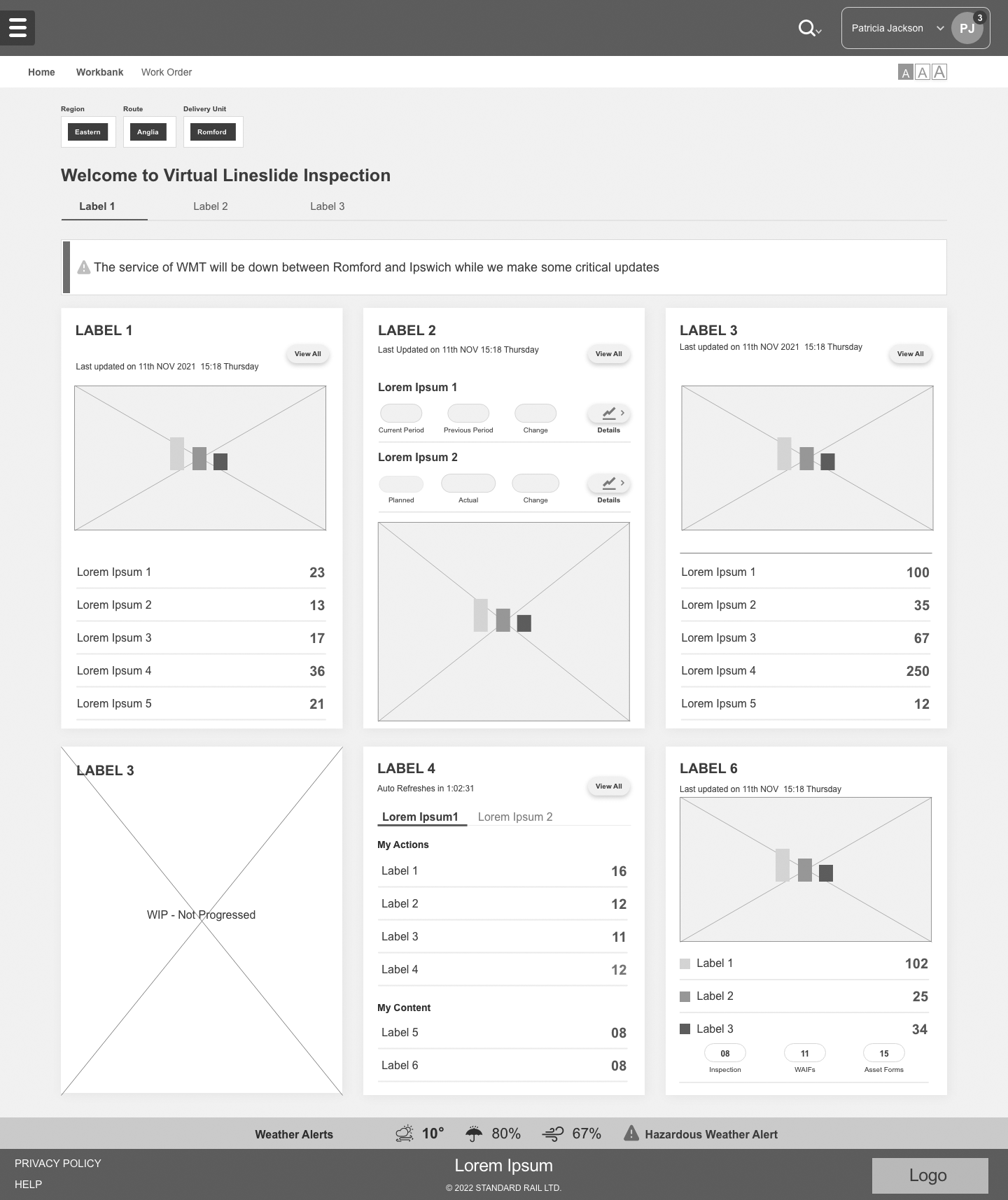
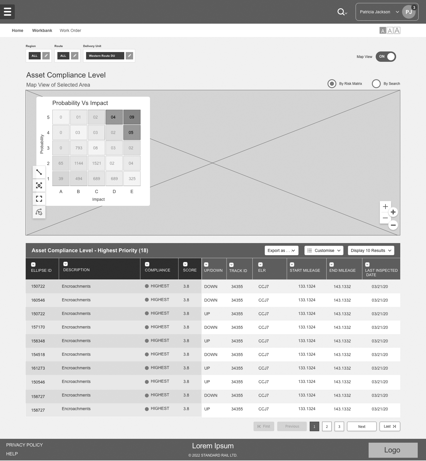
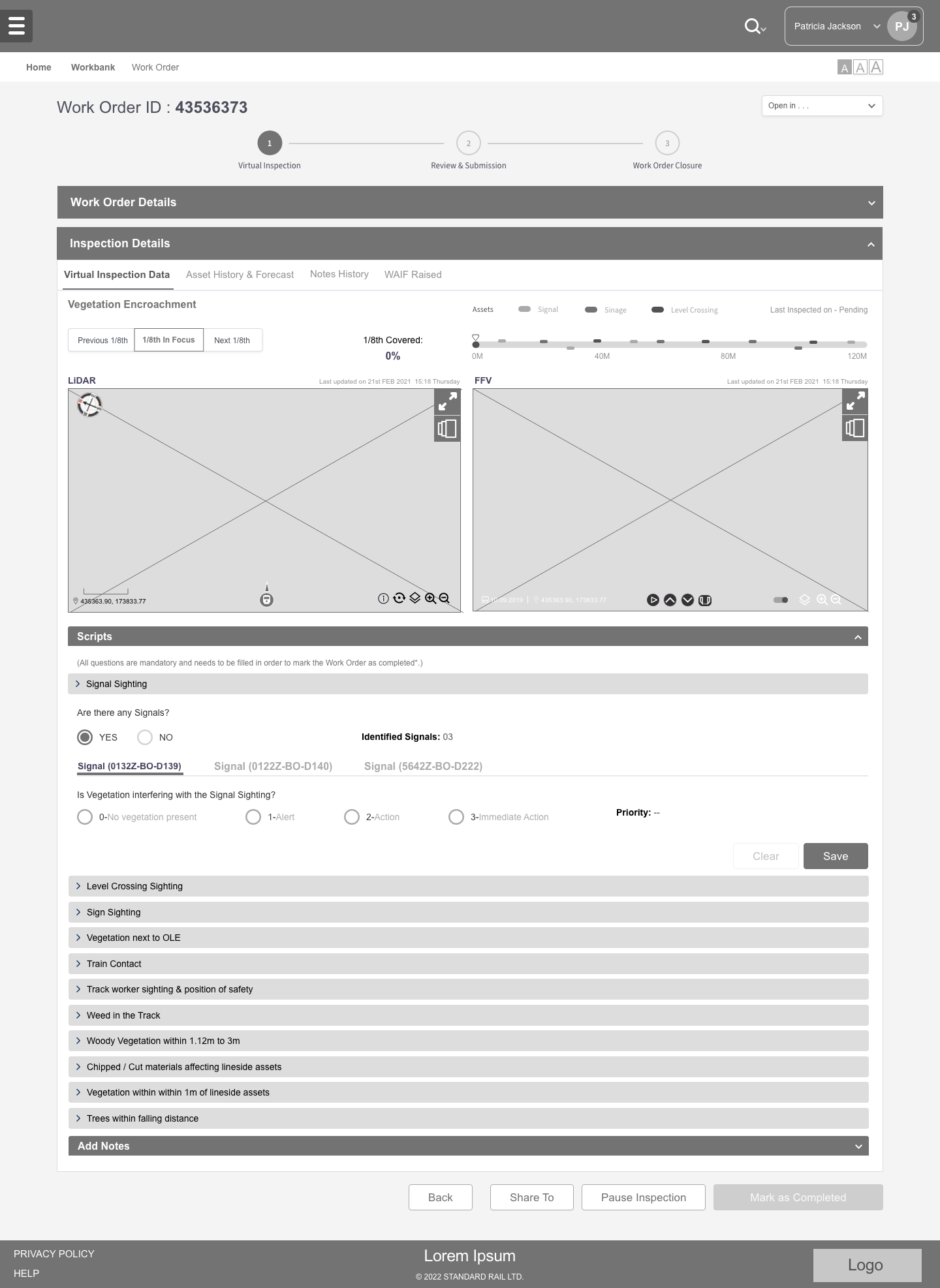
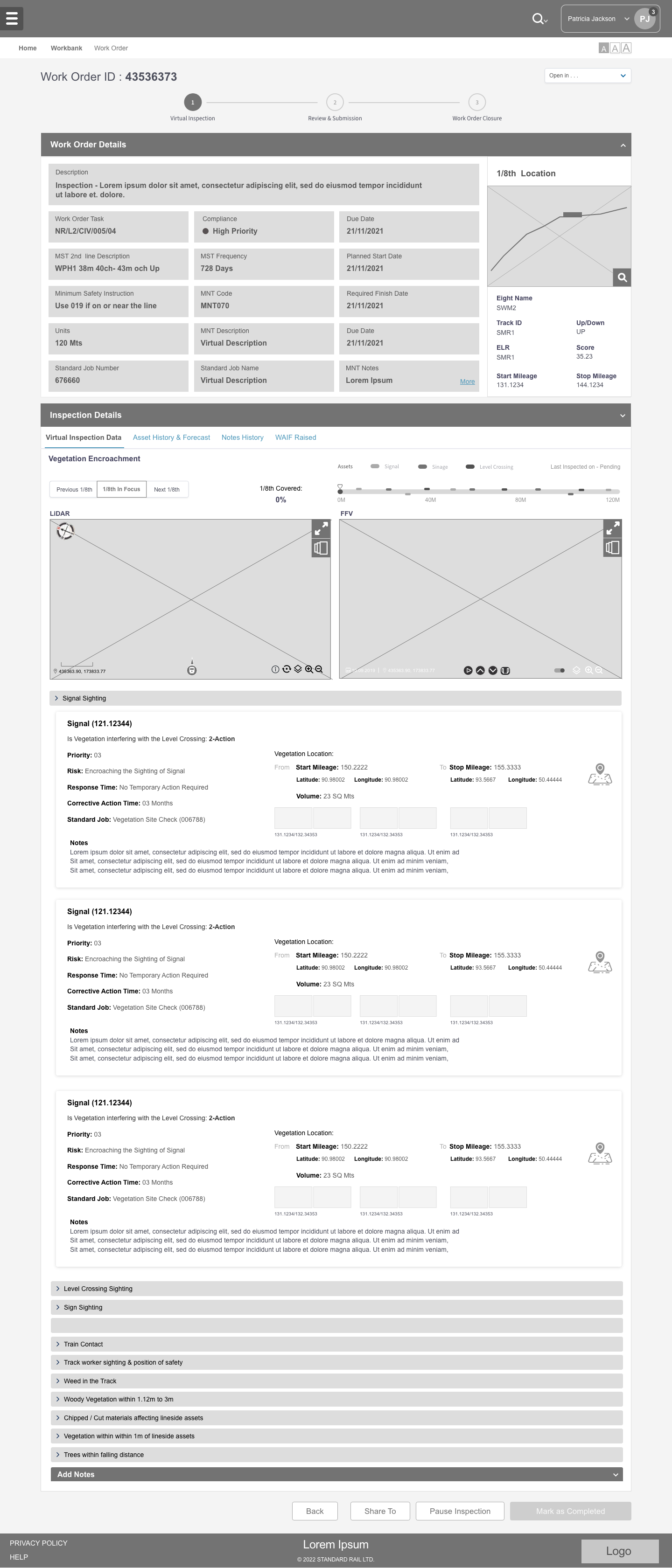
Once wireframes were signed off, design moved into the development team's hands. The build was split into three prioritised releases, each one tested against user stories, with the feedback feeding directly back into the next iteration.
The platform serves a specific audience that values functionality over visual flourish — and it had to be built within the constraints of an industry-regulated environment. Managing a focused agile team let us move quickly without compromising design rigour or engineering quality.
Design is a continuous practice — never truly "complete". Once the platform was in users' hands, we set up structured usability studies, synthesising findings through affinity maps, pattern-identification sheets, and insight templates to drive the next iterations.
Before the first release I agreed a scorecard with the client so each drop was judged against the operational problem — unsustainable manual inspection — rather than against features shipped.
| Level | Metric | Why it matters | Result |
|---|---|---|---|
| North star | Share of inspections completed virtually | Proves the operating model, not just the UI | 32% less manual dependency in 6 months |
| Adoption | Active inspection engineers | Experienced users choosing the tool | 66% within 3 months |
| Quality | Defect-categorisation error rate | Better decisions, not just faster ones | 18% → 3% (2023–24) |
| Delivery | Design-to-dev handoff time & component reuse | Two vendors building one product efficiently | 15% faster handoff, 30% reuse |
Within months of rollout, the platform was driving measurable change across both the inspection workflow and the wider maintenance operation.
Defect-categorisation error rates also fell from 18% to 3% between 2023 and 2024, driven by clearer workflow design, sharper classification patterns, and guided digital inputs at the point of capture.
The project went on to win the Digital Transformation Award 2023.
VLI was one of the most complex projects I've led recently, and one of the most rewarding. Having time and access to do proper primary research before designing — workshops, field visits, contextual interviews — was the single biggest factor in getting the solution right.
The team owned different user groups, but we reviewed each other's progress twice a week. That cadence kept the product cohesive end-to-end.
Choices that feel obvious to a designer rarely feel obvious to a user. Testing kept us honest and informed every design decision.
Structured sitemaps and system-requirement charts helped us scope a ruthless MVP and stay focused on what mattered most.
Tinton led UX for this project from the very start. His expertise extends well beyond design into communication and attention to detail — both of which proved essential throughout the engagement. He was deeply committed to getting every detail right, has a strong sense of layout and white space, and consistently went above and beyond when adopting new workflow processes. He coordinated and ran workshops with energy, took stakeholder feedback on board, and was quick to act on it. His prototypes earned high marks from business stakeholders.
Boots serves millions of people a week as the UK's number-one prescription dispenser and its favourite beauty retailer — but its app treated health and shopping as separate worlds. I led the UX strategy and a cross-vendor team to design a personal-healthcare layer in collaboration with NHS services: repeat prescriptions, pharmacy consultations, Health Hub guidance and family care, unified with the commerce experience and built to WCAG 2.1 AA from day one.
Boots is a rare hybrid: the UK's largest pharmacy network and its favourite beauty destination in one brand. Its app had grown up on the retail side — Advantage Card, offers, shopping — while healthcare lived in separate flows with different navigation, tone and sign-in. Customers who came to buy skincare and stayed to reorder a prescription had to change worlds mid-journey, and many simply gave up.
The opportunity was strategic as much as experiential. The NHS was actively shifting routine care from GP surgeries into community pharmacy, and Boots already delivered a large portfolio of services on the NHS's behalf. A personal-healthcare layer inside the app — trusted, accessible and connected to NHS systems — could make Boots the place millions of people manage everyday health, not just buy it.
Active Advantage Card members — the largest logged-in health-and-beauty audience in the UK
Active Boots app users, overwhelmingly on the retail side of the experience
Healthcare services delivered on behalf of the NHS and privately — mostly invisible in the app
Sources: Boots UK "Boots at a glance" and "Boots in numbers" corporate fact sheets.
Analytics told a clear story. Over a third of customers who tried to cross from shopping into a health journey abandoned it — at re-authentication, at duplicate forms, at NHS eligibility copy buried three taps deep, and at inconsistent buttons that made the next step unclear. The cost showed up as lost prescriptions nominated to other pharmacies, abandoned service bookings, and support calls for "can't find" and "can't log in".
The regulator raised the stakes. Anything touching medicines and consultations had to meet WCAG 2.1 AA and clinical-governance standards; anything less was a compliance risk, not just a UX flaw.
A nine-person cross-vendor team, a regulated domain, and stakeholders ranging from pharmacists to NHS liaison to legal. My job was to give that group one plan, one vocabulary and one bar for quality — and to protect the customer's trust in every trade-off.
Framed the healthcare-layer strategy, ran it as a Double Diamond with three release gates, and owned the UX budget across two vendors.
Set the mixed-methods plan, recruited across beauty, prescription and carer segments, and ran synthesis as shared workshops.
Chaired a fortnightly clinical-governance review with pharmacy, NHS liaison and legal so copy and logic were signed off before design, not after.
Coached four designers to own a journey each, paired the content designer on plain-English clinical copy, and set the definition of done.
I structured the programme on the Design Council's Double Diamond: diverge to understand the real problem, converge on the one worth solving, diverge again on solutions, converge on what to ship. The shape kept a large team honest — no solutioning before the problem was defined, and no shipping before the solution was tested.
Beauty shoppers browse and want delight. Prescription users arrive with intent, urgency and often anxiety. Carers manage someone else's health on top of their own. Discovery had to honour all three, so I ran a six-week mixed-methods programme with the two researchers, triangulating behaviour with attitude.
In-depth interviews across beauty, prescription and carer segments, including two screen-reader users
Analytics events mapped to the existing cross-domain journey to locate every drop-off
Stakeholder workshops with pharmacy operations, NHS liaison, marketing and legal
The NHS's own direction of travel underpinned the strategy. Community pharmacy was being positioned as the front door for common conditions, and digital prescription management was becoming an expectation rather than a novelty. That gave the business case teeth and the team a north star.
Sources: NHS Business Services Authority; The Pharmaceutical Journal; The Pharmacist; Boots UK corporate fact sheets.
Synthesis ran as a two-day workshop with the whole team and the pharmacy lead. Three behavioural archetypes emerged, each with a different trust threshold — and a problem statement the team could hold in one sentence.
People who already trust Boots with their health in store abandon the app at the point where shopping meets care, because the app makes them prove who they are, repeat what they've said, and guess what the NHS will cover — right when they most need reassurance.

Reorder the family's repeats and ask a pharmacist a quick question without booking time.
High — health info must feel clinical and clear.

Manage long-term prescriptions independently, read dosage clearly, book a flu jab.
Critical — an accessibility failure means abandonment.

Handle a parent's prescriptions and appointments alongside her own, with consent in place.
High — needs clear consent and privacy boundaries.
With the problem fixed, I opened the team up again: ideation sprints per archetype, service blueprints that mapped app steps to pharmacy operations and NHS systems, and rapid prototypes tested weekly. Then we converged — first on a design system that made accessibility the default, then on a scoped MVP.
Every health journey depended on back-stage actors — the pharmacy system, NHS eligibility checks, the dispensing team, the store. Blueprinting each journey with pharmacy operations exposed where the app promised something the store couldn't yet keep, and where a single API could remove a whole screen.
Lands on a product or a health service from search or Health Hub.
Is this covered? Am I eligible? Who is it for?
Order, book or ask — one clear primary action.
Where is it? When can I collect?
Collect in store or receive at home; reminders for next time.
Rather than retrofitting compliance screen by screen, I directed the team to build WCAG 2.1 AA into the tokens and components. Every button, form field and status pattern a designer or engineer picked up inherited compliance automatically — the fastest route to 100% across dozens of templates.
Every colour pairing validated before approval for product flows.
Prescription status always paired colour with icon and text.
Focus order, live regions for status updates, descriptive labels throughout.
Critical for older users and motor impairment in prescription flows.
Leaflets reflowed for mobile with adjustable text and plain-English summaries.
Content designer paired with pharmacists; reading age targeted at 9–11.
I ran MoSCoW with the Head of Digital, Pharmacy Operations and the engineering lead. The rule: if it didn't remove a repeated question, surface eligibility earlier or make status visible, it waited — however commercially attractive.
Fortnightly review cadence and content-first drafting so approval ran in parallel with design, not after it.
Health data never used for marketing personalisation; consent flows for carers designed with legal and data protection.
Shared tokens, shared definition of done and cross-review so seams never reached the customer.
Service blueprints with pharmacy operations before any status or timing was shown in the UI.
Before anything touched Figma, the team and I spent two afternoons at the whiteboard with a pharmacist and the engineering lead, sketching the three flows the MVP had to get right: onboarding, medicine tracking and appointment booking. Working at marker speed let us argue about sequence and logic — not pixels — and throw away ideas cheaply.
Two decisions were made standing at this board. The scan → review → set → confirm spine for medicine tracking came from the pharmacist walking us through how a repeat is actually dispensed. And the note at the bottom — "how many people, for you or family members?" — is the moment the carer journey stopped being a "could" and became part of the booking flow's first question.

Before any visual design, the team put deliberately rough Figma wireframes in front of customers and pharmacists. Each one was a provocation — a single hypothesis made tangible enough to argue with.
One home for care and commerce — with promotions switched off in health contexts.
Show "NHS · Free" or "Self-pay" on the card, not on the last step.
A four-step tracker so "where is it?" never needs a phone call.
Carers manage others' care with explicit, revocable consent.
The shipped screens keep Boots' navy identity for the shell and use NHS blue only where a service is genuinely NHS-funded, so the badge itself carries meaning. Clinical restraint in health contexts, plain-English copy approved by pharmacists, and AA contrast throughout.
Repeats due sit above the fold with a single reorder action. Guidance is labelled as NHS-reviewed. No offers appear in this view.
Pharmacist assessment and treatment if needed. Ages 5+.
Private service. Check what your destination needs.
Ages 40+. Walk in or book a slot.
"Who is this for?" comes first so eligibility resolves before a customer commits. NHS-funded services carry the blue badge; private ones show a price.
Status streams from the pharmacy system into a four-step tracker with plain-English timing. Colour is always paired with a label.
Carers switch between people they look after; consent is visible and revocable, mirroring NHS proxy-access rules.
Standard usability metrics weren't enough — a health journey can be easy and still not trusted. Alongside task success and time-on-task I added a trust-to-act score: after each task, how comfortable would you be doing this for real, today, for yourself or someone you care for? Three moderated rounds with 24 participants, including screen-reader users, ran across the release gates.
| Level | Metric | Why it matters | Result |
|---|---|---|---|
| North star | Cross-domain journeys completed | Proves care and commerce work as one product | Drop-off down 34% |
| Adoption | Self-service health actions (reorder, book, ask) | Shifts routine care into the app | +27% in 3 months |
| Inclusion | WCAG 2.1 AA conformance across health flows | Regulatory bar and the Margaret persona | 100%; zero criticals at audit |
| Trust | Trust-to-act score (1–7) after task | The value proposition is confidence | +2.3 over three rounds |
| Efficiency | Repeat reorder time vs legacy | The most frequent journey | 2.4× faster |
Within three months of phased rollout the unified experience was outperforming the legacy journeys on every metric the steering group had agreed. The clearest signal: customers stopped giving up at the seam between shopping and care.
Qualitative signals moved with the numbers: NPS on prescription and consultation flows rose by 18 points, "can't find / can't log in" support contacts fell by nearly a third, and the annual accessibility audit returned zero critical issues for the first time in the platform's history.
Healthcare isn't a UX category; it's a constraint that raises the bar on everything. Designing to a regulatory standard forced rigour into every decision — and the resulting discipline made the commercial side of the product stronger too.
Retrofitting WCAG is slow and unreliable. Tokens and components that are accessible by default made 100% conformance a property of the system, not a heroic audit.
Inviting pharmacy and legal into a fortnightly rhythm turned sign-off from a late blocker into early design input.
Clear language, generous targets and clinical restraint did more for conversion than any promotion. In health, every decision earns or burns trust.
Leading a cross-vendor team is never easy, but Tinton brought clarity and vision from the very first workshop. The Design for Delight approach he introduced genuinely transformed our digital health experience. He treats accessibility not as a checkbox but as a craft, and the team learned a huge amount from how he framed every decision around customer trust.
A complete redesign of MAPFRE's legacy auto-insurance quote and bind platform — replacing a friction-heavy single-page form with a guided wizard experience aligned to modern accessibility and conversion standards.
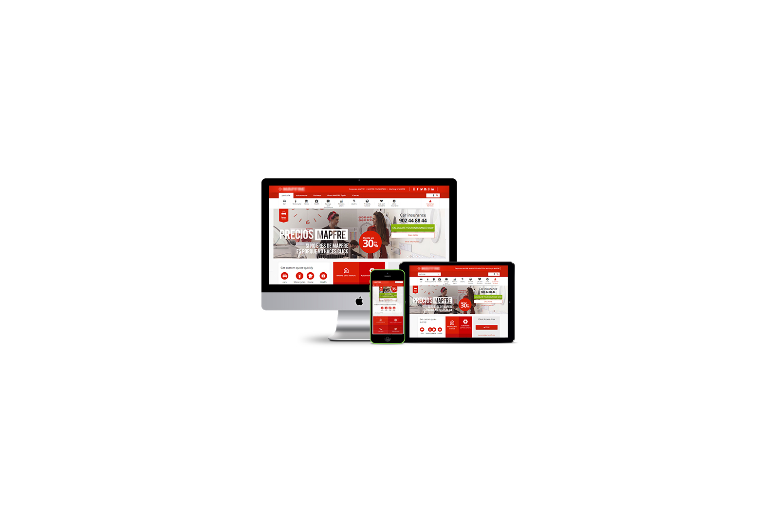
MAPFRE Insurance is one of the United States' most established carriers, offering coverage across auto, home, motorcycle, watercraft, and commercial lines. In Massachusetts alone, they hold the position of largest private passenger auto insurer, largest homeowners insurer, and largest commercial auto insurer.
Despite this market dominance, their digital experience told a different story. The Online Bind platform — the journey customers used to quote and purchase auto insurance — had aged poorly. Internal customer-satisfaction surveys flagged it as a major friction point, with measurable impact on conversion, usability, and customer satisfaction scores.
MAPFRE's leadership made the call to commission a full redesign: a refreshed visual system, a re-architected quote flow, and full alignment to current accessibility standards. I came in as Principal UX Designer and engagement lead, owning strategy, research, design direction and project management end-to-end.
The MAPFRE team had decades of insurance experience — from developers through to risk underwriters and product owners. They knew their existing platform was hurting the business, but they didn't yet have a clear picture of what the new experience needed to look like. My first job was to understand the problem deeply enough to define the solution alongside them.
Adding pressure to the brief: an industry insurance convention in the US was coming up fast, and MAPFRE wanted to debut the new product to potential investors there. That hard deadline shaped every prioritisation call I made. We had to be lean, iterative, and ruthless about cutting complexity.
A market leader with a dated platform, a three-person delivery team, and an investor showcase that could not move. Leadership here meant setting a plan the client could see, getting every discipline aligned in the first week, and holding the line on scope so the right product shipped on the right date.
Worked backwards from the convention date into a five-stage plan with deliverables, validation checkpoints and stakeholder touchpoints, so MAPFRE always knew where the investment was going.
Designed the discovery programme: cross-functional workshops, a competitive scan, a heuristic evaluation, five contextual interviews and a 25-card open sort, synthesised into one persona and one problem to solve.
Put risk, legal, engineering, BA and insurance experts in one room in week one, aligned business, user and technical success lenses, and co-facilitated the MoSCoW that protected the deadline.
Ran the engagement as its project manager: scope, milestones, hand-off quality, and WCAG 2.1 AA designed into components before any screen was composed.
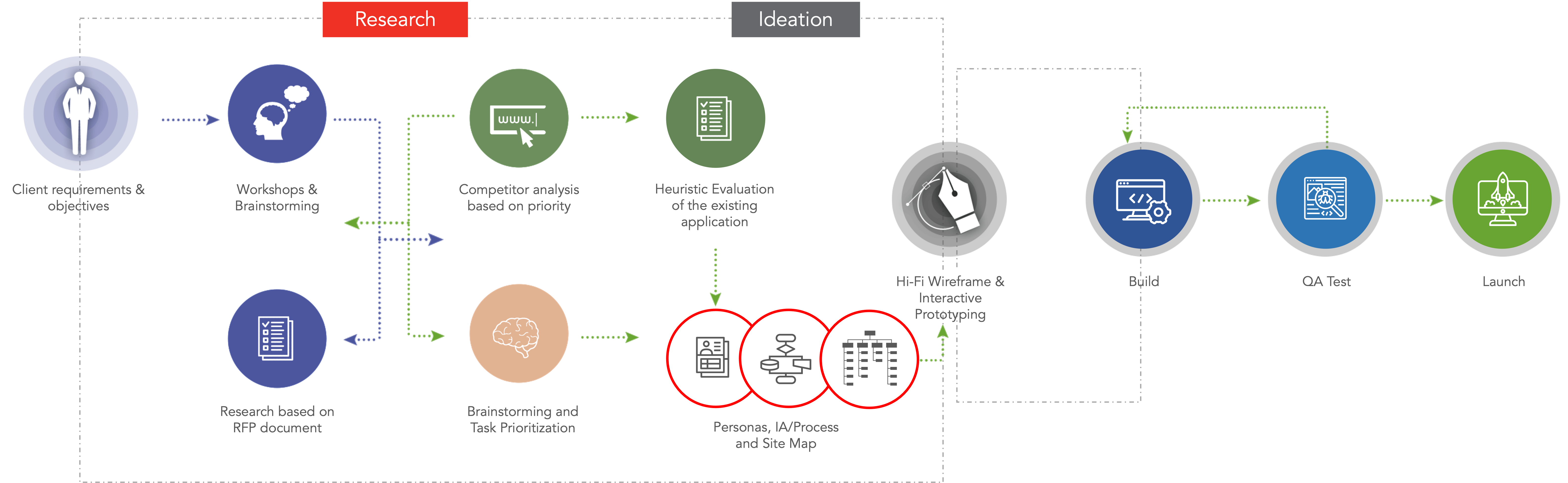
Working backwards from the convention deadline, I mapped a high-level UX plan covering five stages — each with its own deliverables, validation checkpoints, and stakeholder touchpoints. This gave the client a transparent view of where their investment was going and where they could expect to weigh in.
Workshops, competitive scan, heuristic evaluation, contextual interviews
Personas, empathy maps, MoSCoW prioritisation, IA, task and user flows
Visual language alignment, layout exploration, hi-fi screen library
Hi-fi prototype, accessibility annotations, engineering handoff
Usability testing, affinity mapping, iteration loops
I opened with a structured workshop sequence — bringing technical, legal, risk, design, business analyst, and insurance experts into the same room. Getting everyone aligned upfront saved weeks of asynchronous back-and-forth later. By the end of week one, we had shared agreement on business objectives, technical constraints, and the priority slice for MVP.
Next came the competitive and comparative analysis. I evaluated several direct competitors and a few adjacent insurance providers, focusing on product offerings, online purchase flows, mobile and tablet experiences, and "Request a Quote" patterns.
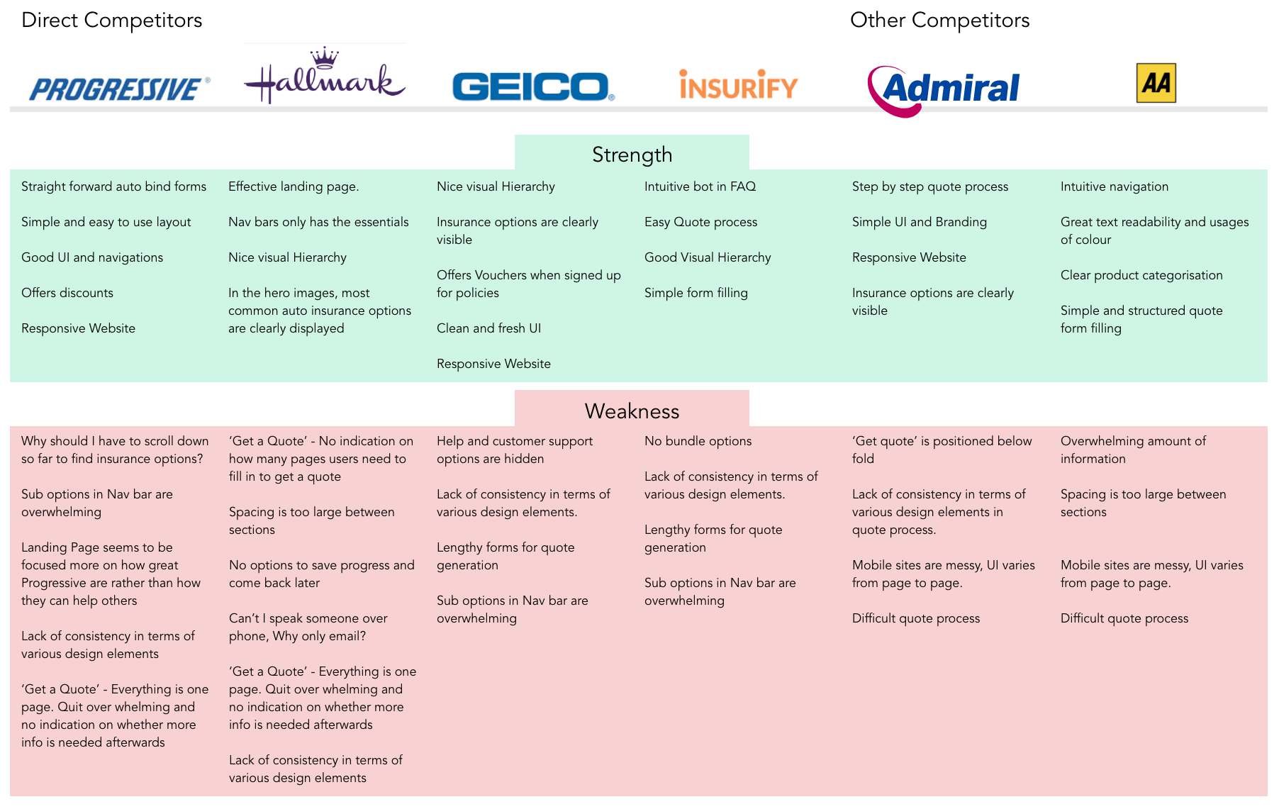
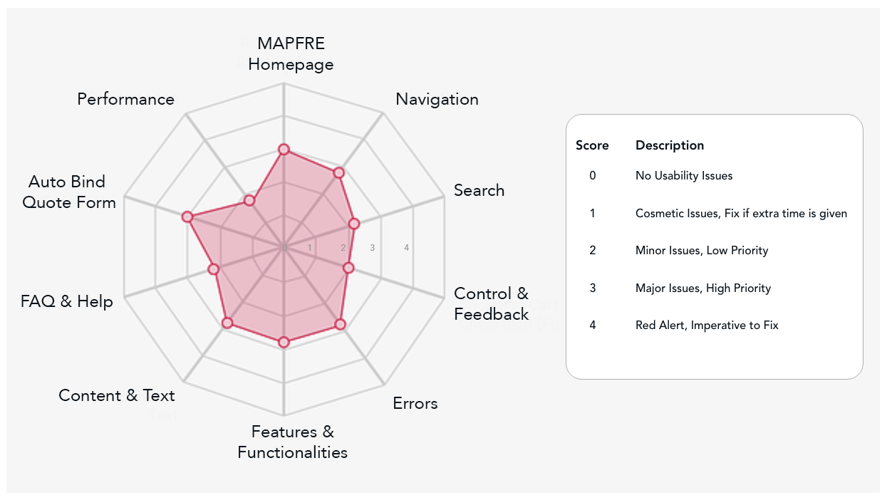
For the existing MAPFRE Online Bind, I ran a Nielsen-style heuristic evaluation focused on the core quote-to-bind functionality. The goal was to surface the most acute usability flaws before any new design decisions were made.
I interviewed five participants ranging from late teens to late sixties, all of whom had purchased some form of online insurance within the previous two years. The mix included working professionals and one recent retiree. Each interview blended open-ended exploration with structured probes around their last purchase experience.
From these conversations, four behavioural themes emerged repeatedly:
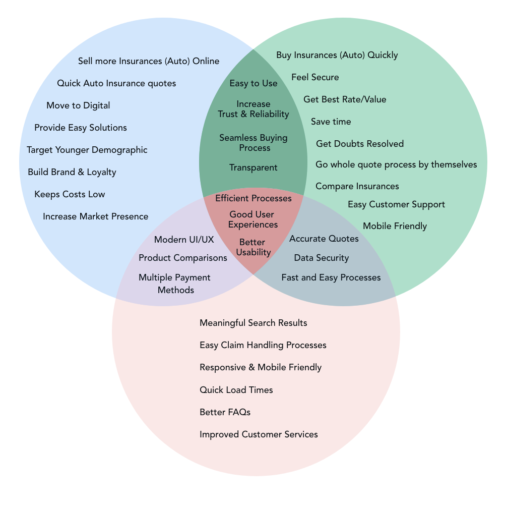
With research synthesised, I worked with stakeholders and product owners to define what success actually looked like — but viewed through three independent lenses. Aligning all three was the prerequisite for everything that came after.
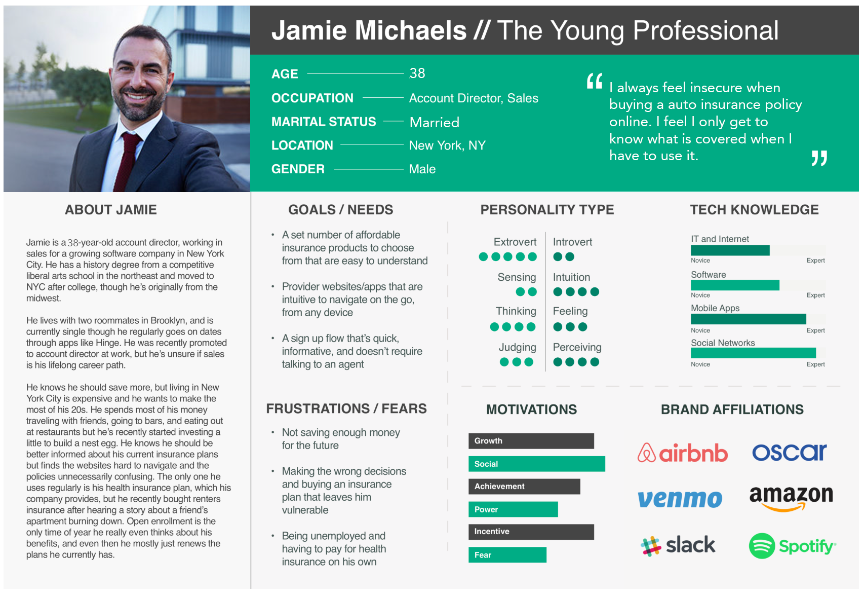
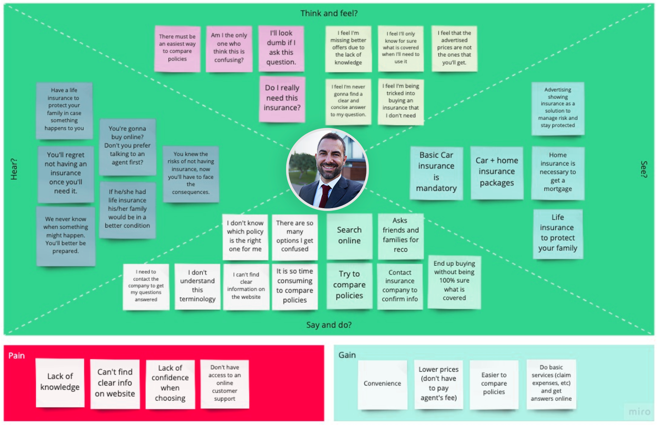
Synthesising interview themes, I built one primary persona — Jamie — capturing the most representative behavioural pattern: a working professional who values clarity, fairness, and self-service, but who has been burned by previous insurance experiences and approaches every new provider with cautious scepticism.
With a fixed deadline and a finite team, ruthless prioritisation was non-negotiable. I co-facilitated a MoSCoW workshop with the project manager, dev lead, and business analyst to bucket every candidate feature into Must, Should, Could, or Won't (this release).
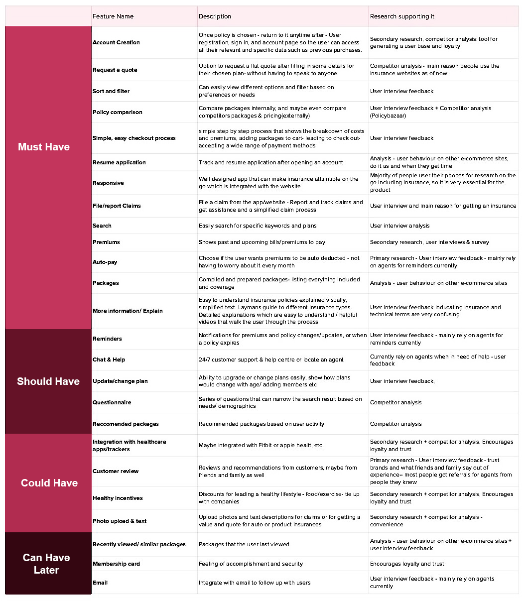
MVP defined in week one, MoSCoW gates on every request, and a stage-gate review at the end of each of the five stages so slippage showed early.
Plain-English coverage explanations, "why we ask" tooltips on every field, and a visible premium, deductible and exclusions breakdown before the bind step.
Reuse of MAPFRE's design tokens and style guide, a componentised front-end, and the BA and SME used as force multipliers on content and underwriting logic.
The competitive scan showed carriers failing on mobile. Responsive behaviour was designed per component and tested in hi-fi across desktop, tablet and phone.
With personas locked and the feature set agreed, I ran an open card-sort exercise to inform the site map. Participants received twenty-five distinct insurance products on index cards and grouped them however felt most natural — then named those groups themselves. The aggregated patterns translated cleanly into the final IA.
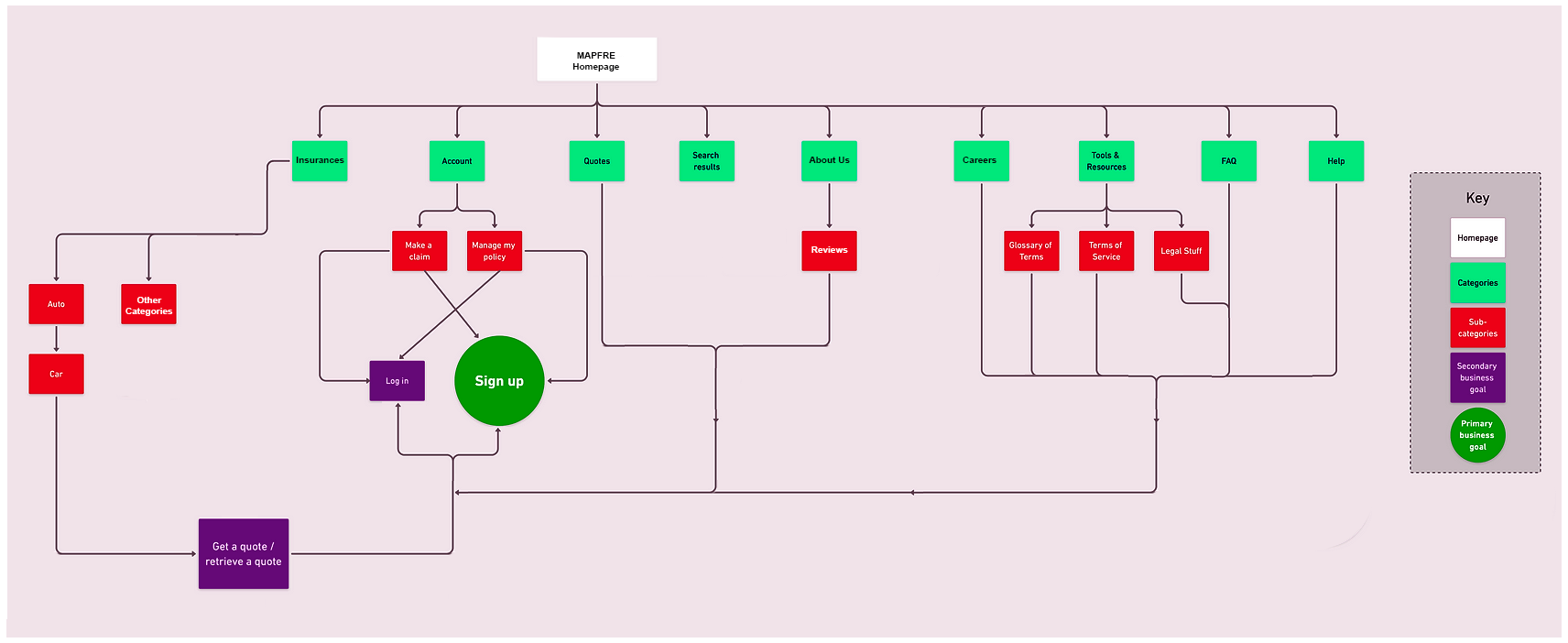
To anchor every interaction decision in a real customer journey, I built a task flow tracing the steps a customer like Jamie would take to obtain an auto bind quote.
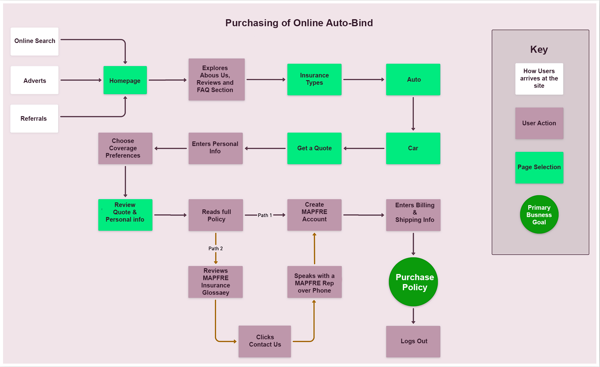
From task flow, I expanded into a full user flow — explicitly modelling the obstacles, decision branches, and trust-eroding moments Jamie might encounter, and the design responses to each. The extra time invested at this stage paid back many times over once we entered hi-fi design.
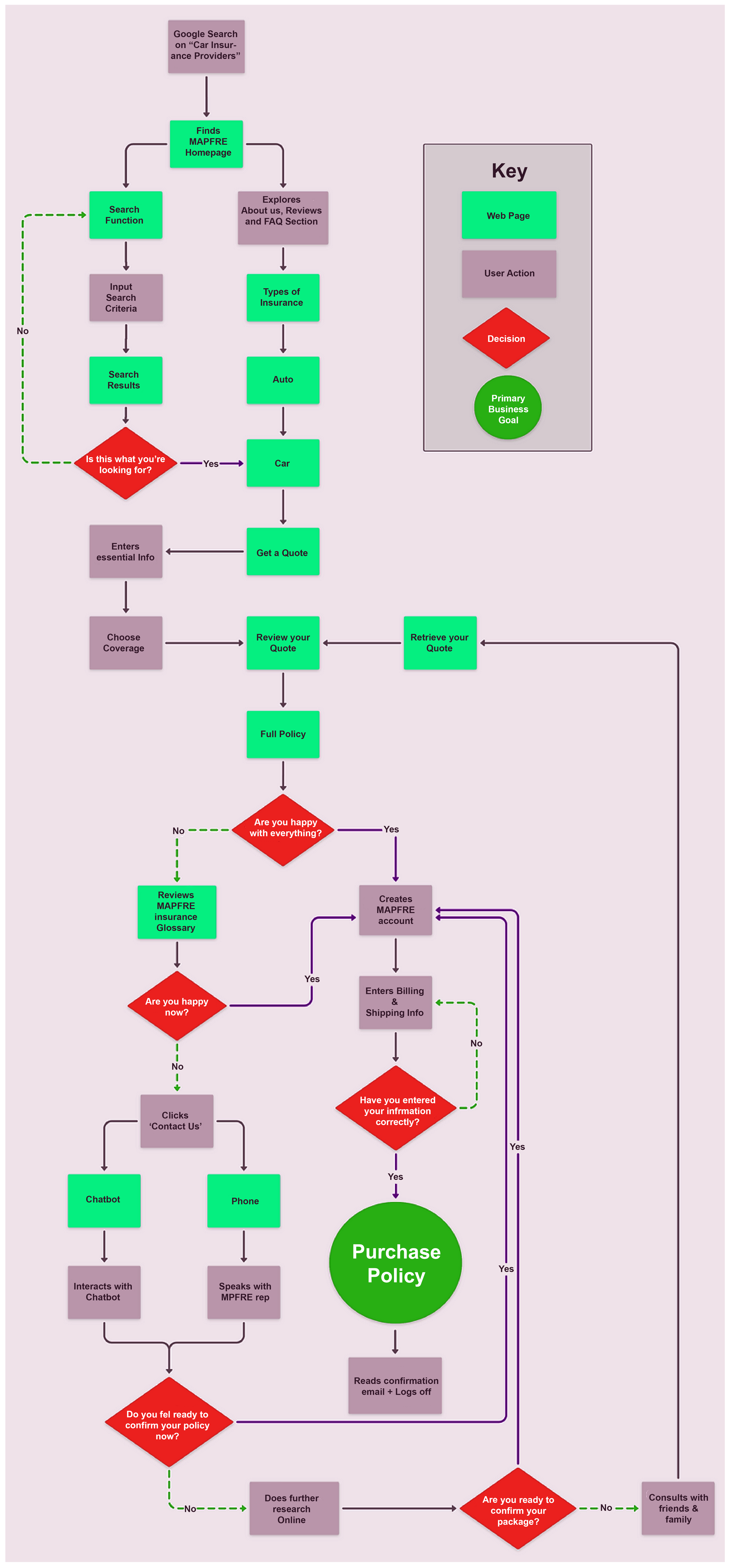
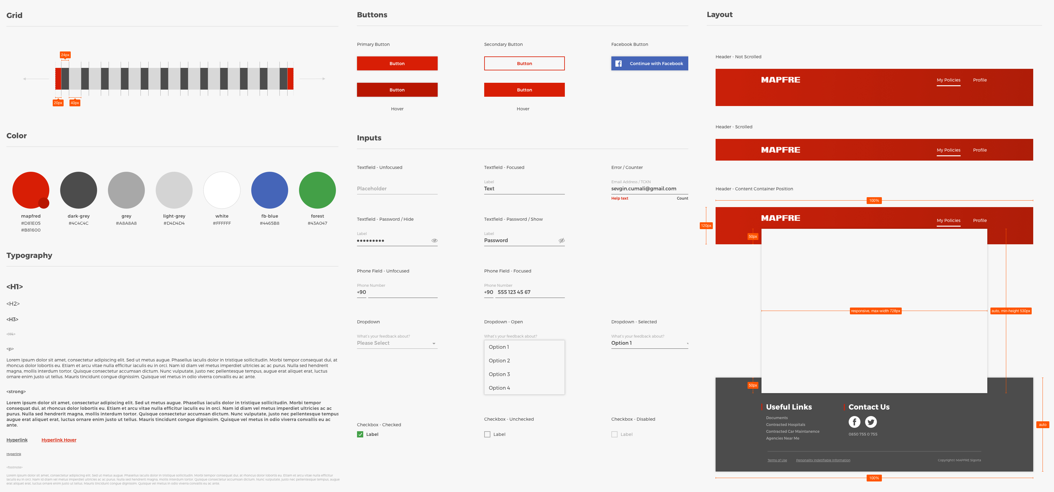
MAPFRE already had a documented brand identity. Rather than reinvent it, my role was to extend it forward — keeping the brand recognisable while introducing modern accessibility patterns, responsive component behaviour, and a cleaner information hierarchy. Every wireframe respected the existing style guide to maximise component reuse and minimise downstream UI development effort.
On accessibility, I made sure layout, reading order, focus order, and navigation all met WCAG 2.1 AA at the component level, before any screen-level layouts were composed.
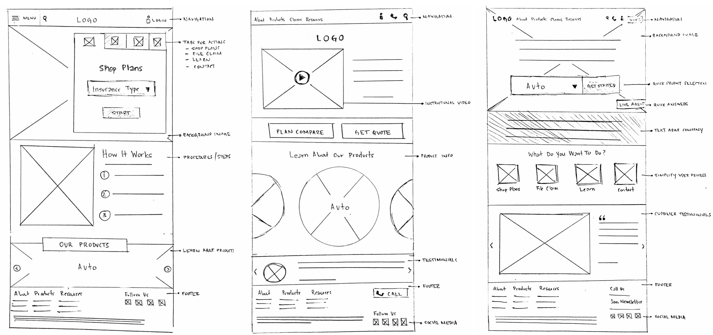
Before committing to a final structure, I sketched three candidate layouts and stress-tested each against the wizard requirements, mobile responsiveness, and the heuristic gaps identified earlier. The exercise made the trade-offs visible to stakeholders and made the final selection an informed, defensible decision.
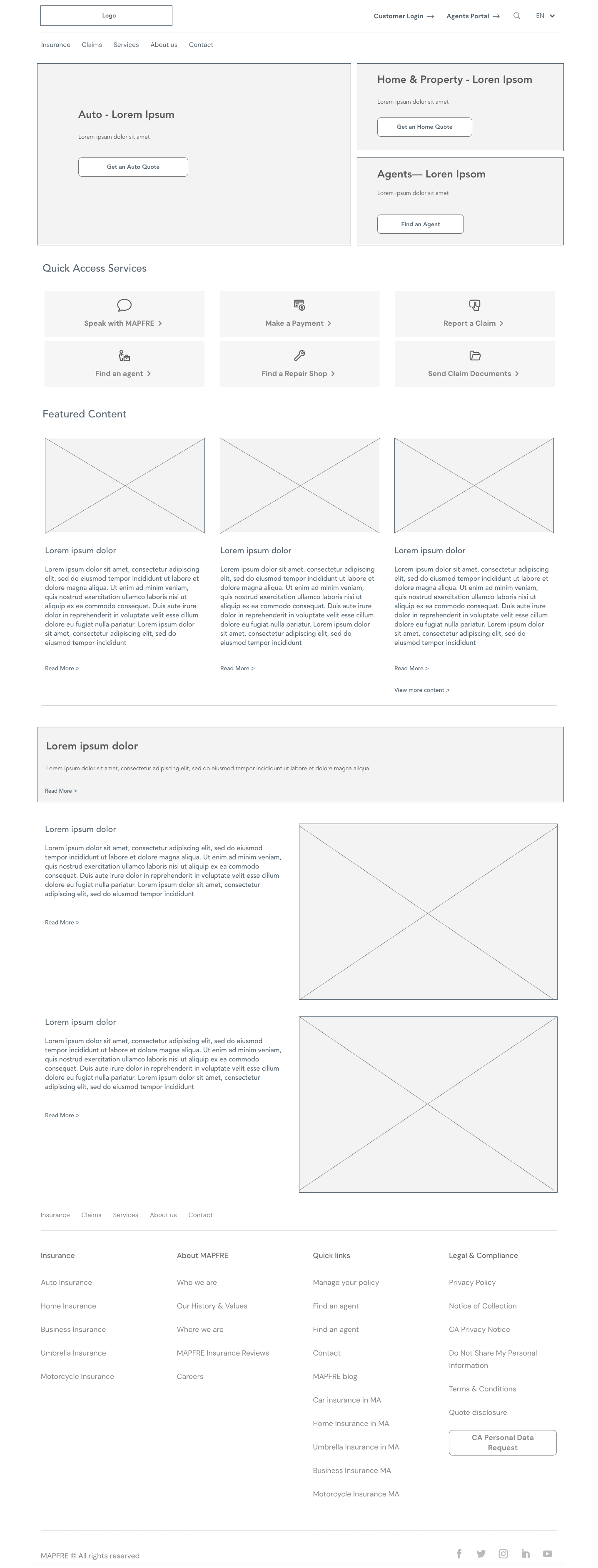
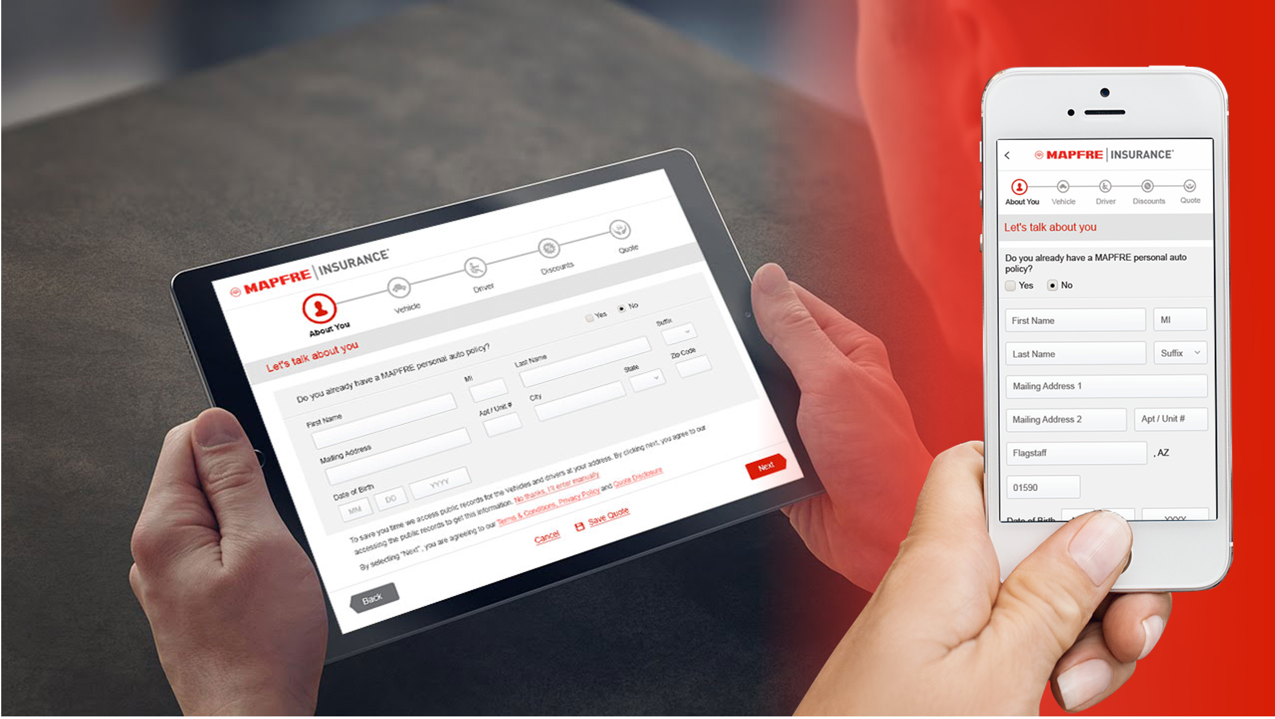
Key screens were taken from low fidelity into refined hi-fi, then re-tested with stakeholders. The final structure flexed across desktop, tablet, and mobile breakpoints without compromising the wizard's logic or the brand's voice.


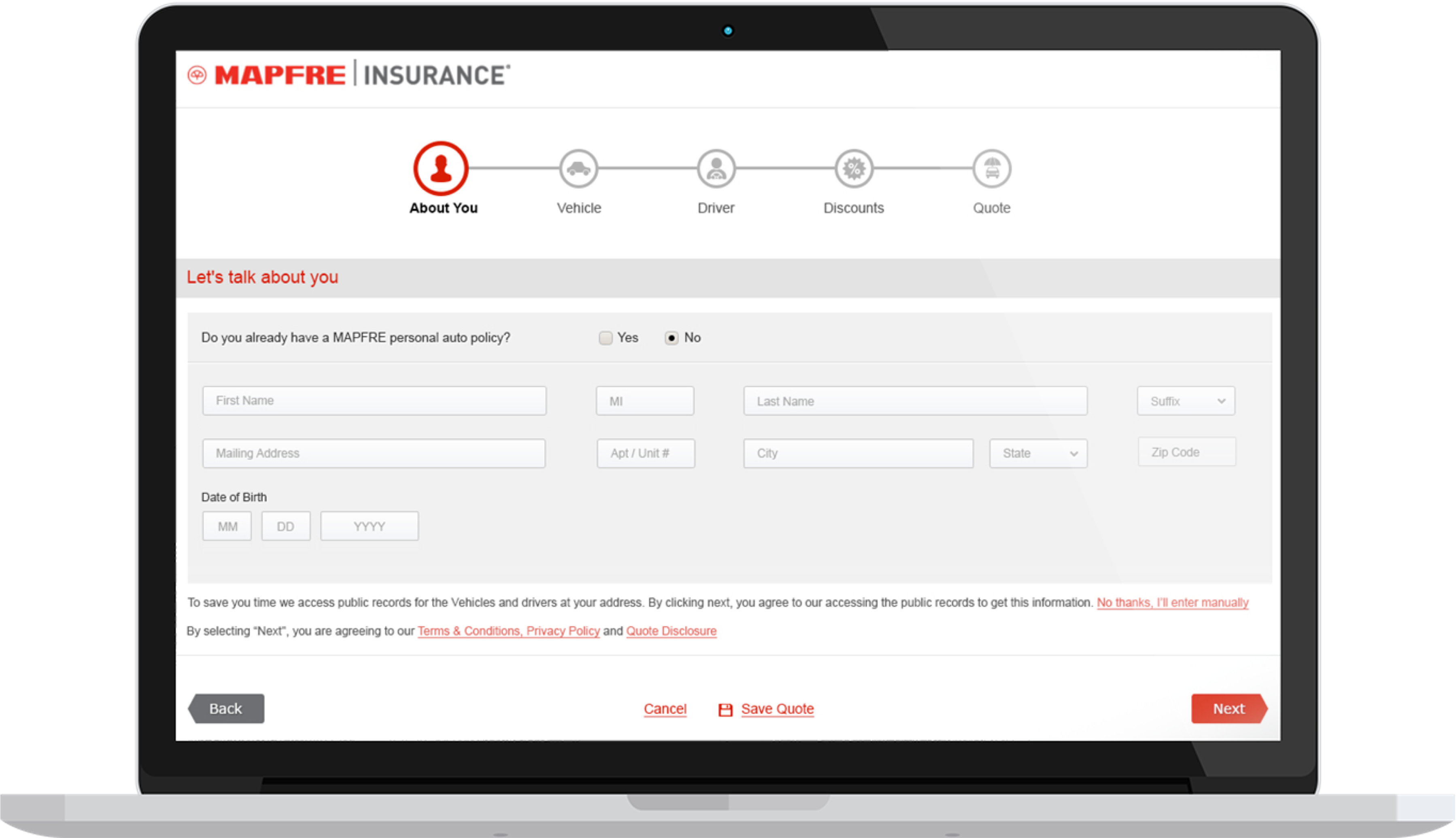
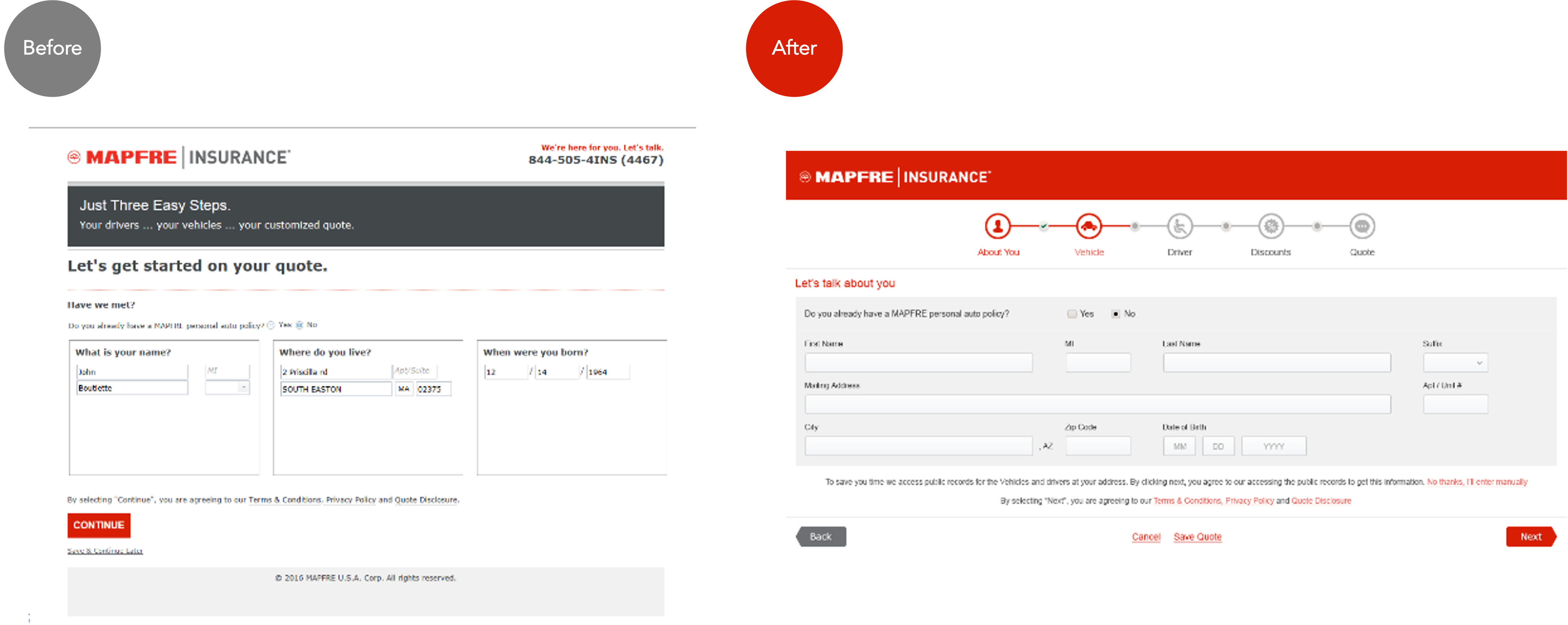
The single biggest experience shift was rebuilding the quote form as a guided wizard. The legacy version asked for everything on one long page — no progress indication, no context for why a question was being asked, and no save-and-resume. Users abandoned the flow at the first sign of friction.
The new wizard chunks the same data into themed steps, surfaces clear progress, and lets the user save and come back later. Every field is justified to the user with a short, plain-language explanation of why it's needed.
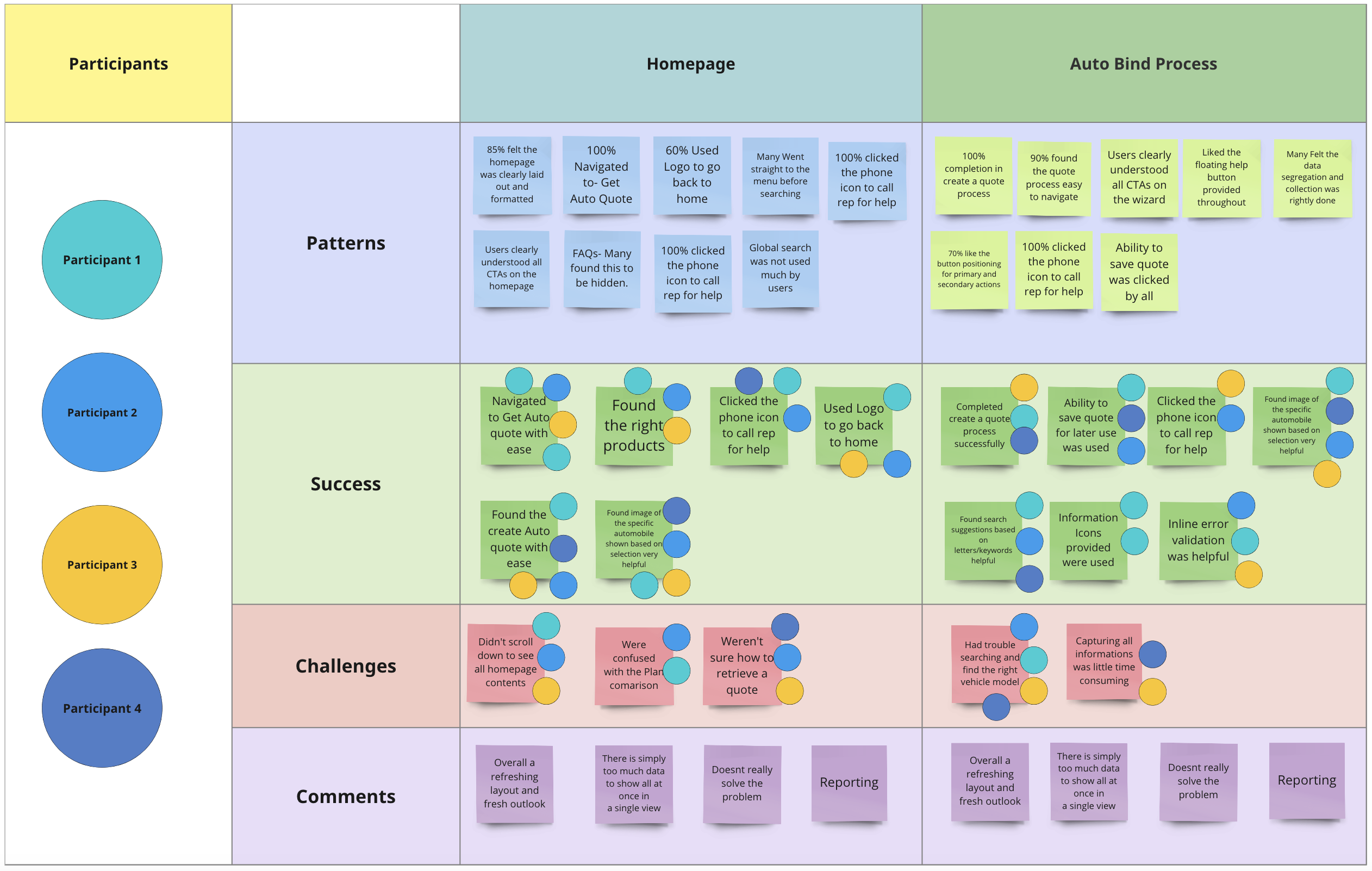
With a working hi-fi prototype in hand, the next job was to stress-test it. I ran moderated usability sessions over video with four participants who matched the persona profile, with each session focused on three structured objectives:
I documented findings in an affinity map, clustered into themes, and prioritised the resulting backlog into "fix before launch" versus "fix in v1.1".
Before design started I agreed a small scorecard with the product owner, so the redesign would be judged against the problem MAPFRE commissioned us to fix, a quote journey that taxed conversion, rather than against the number of screens delivered.
| Level | Metric | Why it matters | Signal after launch |
|---|---|---|---|
| North star | Online quote-to-bind conversion | Proves the platform enables growth instead of taxing it | +41% within the first quarter of rollout |
| Self-service | Agent calls about unfinished online quotes | Shows customers can bind without picking up the phone | Dropped sharply post-launch |
| Quality | Task completion and errors in moderated tests | Trust is built or lost inside the wizard | 100% completion, 0 errors across 4 sessions |
| Delivery | Convention debut and launch accessibility audit | The date and the AA commitment were both non-negotiable | Debuted on schedule, 0 critical accessibility issues |
The redesigned Online Bind debuted at the industry convention on schedule. Within the first quarter of full rollout, the numbers told a clear story: every key metric moved in the right direction, and the platform was now an enabler of growth rather than a tax on it.
Customer-satisfaction tracking improved measurably across the post-launch period. Agent call volume related to "I couldn't finish the online quote" dropped sharply — freeing agent capacity for the higher-value conversations they were paid to have.
MAPFRE was the project that taught me how powerful a hard deadline can be when paired with disciplined prioritisation. The convention date didn't just compress the schedule — it forced clarity at every decision point. Every "could we also..." conversation ran through the MoSCoW filter, and that single piece of discipline kept the team focused on what actually mattered.
Without the convention date, the project would have ballooned. The fixed end-date kept stakeholders aligned on what was MVP and what was post-launch.
The wizard worked here because each step was meaningfully different and the customer could see progress. Wizards aren't universally better — context decides.
Getting risk, legal, tech, and design into the same room upfront eliminated weeks of asynchronous email loops. Front-loaded alignment paid back many times over.
Tinton ran the MAPFRE Online Bind project end-to-end and brought a calm rigour to it that the whole team noticed. He turned a tangle of legacy issues into a clear plan, kept us focused on the convention deadline, and made sure accessibility and brand discipline were never traded away. The redesign hit every metric we set, and the new wizard flow is now the template the team reaches for on every new product line.
A UX strategy and interaction framework for embedding autonomous AI agents into the Intuit Enterprise Suite — letting finance teams delegate complex, multi-step workflows to AI while keeping humans in command of every consequential decision.
Generative AI gave software the ability to answer. Agentic AI gives it the ability to act — to plan a sequence of steps, call tools, make intermediate decisions, and complete a goal on the user's behalf. For enterprise finance software, that shift is transformative and terrifying in equal measure: the upside is enormous productivity, the downside is an autonomous system making consequential financial moves the user didn't fully authorise.
Intuit set out to embed agentic capabilities across the Enterprise Suite so that finance teams could hand off repetitive, multi-step work — reconciliation, anomaly triage, compliance checks, reporting — to AI agents. My mandate was to define the UX strategy and interaction framework that would make these agents genuinely trustworthy: powerful enough to save real time, transparent enough that a controller would stake their name on the output.
This wasn't a single screen. It was a design language for a new category of interaction — one the whole organisation could build against.
Early prototypes of agentic features tested badly. Not because the AI was inaccurate — the models were strong — but because users didn't trust what they couldn't see. An agent that silently reconciled a month of transactions and reported "Done" left controllers anxious rather than relieved. They re-checked everything by hand, erasing the time savings entirely.
The core tension was clear: the more autonomous the agent, the less the user understood what it did — and in finance, not understanding is not an option. Auditability, reversibility, and accountability aren't nice-to-haves; they're the job.
The design problem became: how do we let an agent do more, while making the user feel more in control, not less?
A new category of interaction, a team of eight, and product teams across vendors and time zones waiting for a standard. Leadership here meant owning the strategy and the research programme, turning what we learned into principles other teams could build against, and coaching my designers to work with product, engineering and AI/ML as one team rather than hand off to them.
Set the direction with Intuit UX leadership: trust, not accuracy, as the design problem. Authored the eight principles and the five-level autonomy spectrum that became the Suite-wide standard and the acceptance criteria for shipping.
Designed and sequenced the programme from attitude to behaviour: the 2025 ideation sprint, 18 contextual interviews and diary studies over five weeks, Wizard-of-Oz sessions on the wireframes, and three rounds of moderated testing with 24 finance professionals.
Co-owned the guardrails with PM, engineering, security and compliance, and set up the fortnightly governance council where scopes and thresholds are agreed before anything is built.
Grew four designers from screen owners into pattern owners. Each ran a scenario end to end, from research script to design-system component, with my review as the quality gate rather than my hand on every flow.
Before the framework existed, there was a hard deadline. In April 2025 leadership needed credible options to bring Intuit Assist to QuickBooks Online customers by peak season — while the open-ended conversational experience would not be ready for public beta in time. I facilitated a cross-functional ideation sprint with design, product and engineering to answer one question: what ways could Assist come to life in QBO by peak, given the timeline and constraints we face?
The sprint produced 60+ ideas, four voted themes and eleven sketched concepts. More importantly, it surfaced the principles — guided over open-ended, defined expertise over global claims, uniquely Assist over duplicated paradigms — that later became the trust-and-control framework scaled across the enterprise products.
Quantity first, judgement later. The wall below is the team's own sticky notes, clustered afterwards by the job each idea does for the customer. The clusters became the backbone of the concept sketches and, later, of the pattern library.
The voted themes were turned into concept sketches inside the QuickBooks shell so stakeholders could judge placement and intent, not visual polish. Seven of them are shown here, recreated at mid fidelity from the sprint’s lo-fi frames; the full set also covered Assist Playground, Invoice Reminder, Website Scrape, Generative Templates and Connect to an Expert.
The monthly business brief became the anchor concept. Working the flow on the whiteboard produced the decisions that shaped the public launch and the private beta — and, in hindsight, the first articulation of the Bounded and Observable principles.
To design delegation to AI, we first studied how finance professionals delegate to people. Over a five-week research cycle, the team ran contextual interviews with 18 controllers, accountants, and finance managers, plus diary studies tracking how and when they handed work to junior staff — and critically, what made them trust the result.
Three trust mechanisms surfaced consistently, and they became the backbone of the whole framework.
Managers trust delegated work when they can see the steps, not just the outcome.
Trust scales with clear boundaries — "you can do X, but check with me before Y."
People delegate freely when they know a mistake is reversible and traceable.
I designed the programme to answer one question — what makes a finance professional comfortable handing consequential work to a system? — and sequenced methods from attitude to behaviour so we weren't designing to opinions alone.
| Method | Who / how many | What it told us |
|---|---|---|
| Cross-functional ideation sprint | Design, PM and engineering; 2 sessions, 60+ ideas, 4 themes, 11 concepts | Which Assist experiences could ship by peak without an open-ended chat — and the principles behind them |
| Contextual interviews | 18 controllers, accountants, finance managers across IES, PPM and Compliance customers | How delegation to people works today: showing work, setting limits, owning undo |
| Diary study | 9 participants, two weeks | Which tasks they'd hand off first and what they re-check regardless |
| Wizard-of-Oz sessions | 12 sessions, researcher playing the agent | Where confidence dropped: silent actions, technical logs, irreversible steps |
| Co-design workshops | 3 workshops with customers, PM and engineering | The autonomy levels people would actually accept per task |
| Log & ticket analysis | 18 months of support tickets and usage logs | The repetitive, multi-step work with the highest time cost |
Research gave us the roles; scenarios gave the team a shared picture of what "an agent doing finance work" actually looks like, hour by hour. Each scenario names the trigger, what the agent does on its own, where the human must step in, and how the outcome is recorded. They became the test scripts for every round of validation.
From the research I distilled four design principles that every agentic feature in the Suite would be measured against. These became the shared language for designers, PMs, and engineers — and the acceptance criteria for shipping.
The agent's plan and progress are always visible. No black-box actions — the user can watch reasoning unfold in real time.
Users set the agent's authority up front. Low-risk actions run freely; consequential ones pause for explicit approval.
Every agent action is atomic and undoable. A full audit trail maps each change back to the step that caused it.
The human is always the named decision-maker. The agent proposes and executes; the user owns and signs off.
Friction scales with impact. Low-risk steps run silently; high-impact ones pause for an explicit, informed decision.
Every suggestion carries its reason, its sources and its confidence — in plain language a controller would use.
Pause, take over or stop at any moment, mid-run, without losing completed work.
Autonomy grows with evidence. The system earns expanded permissions through a visible track record, never by default.
Principles describe the experience; guardrails are the rules enforced in product. I co-owned these with PM, engineering, security and compliance, and they ship as configuration every product team inherits.
| Guardrail | Rule in product | Pattern that surfaces it |
|---|---|---|
| Permission scopes | Agents act only within scopes the user holds; no privilege escalation | Scope shown in the plan header |
| Impact thresholds | Monetary, volume and irreversibility thresholds force a confirmation gate | Approval gate with before/after diff |
| No external submission | Filings, payments and external communications are never sent by the agent | "Prepared for you to send" state |
| Reversibility window | Every action undoable for a defined period; bulk undo for a whole run | Action ledger |
| Confidence floor | Below a set confidence the agent asks rather than acts | Pause-and-ask card |
| Data boundaries | Only the data the task needs; nothing leaves the tenant | Sources listed on every explanation |
| Named accountability | A human owner is recorded on every run and every approval | Sign-off with name and timestamp |
| Rate & blast-radius limits | Caps on actions per run and per hour until trust is established | Run summary with limits shown |
Rather than a binary "manual vs automated," I defined a five-level autonomy spectrum. Each feature in the Suite is placed on this spectrum based on the risk and reversibility of its actions — and users can dial an agent up or down the scale as their trust grows.
Agent suggests; user does everything.
Agent prepares work for user review.
Agent acts step-by-step with approvals.
Agent runs; pauses only on exceptions.
Agent completes autonomously; reports after.
The framework produced dozens of components, but three interaction patterns carry the weight of the whole trust model. Each was validated in usability testing against the four principles.
Before any pattern was drawn, I ran a whiteboard session with the team in April 2025 to work out the anatomy of an agent task, with payroll as the test intent. We traced one job across five columns: intent, input assets, analysis, process and end assets. Under each column we wrote the moments the design had to account for: user inputs and information, operations, user approval and iteration, human intervention versus automation, and work product, implementation and versions. A conversation layer ran along the bottom, tying the canvas together in a single window rather than a chat box.
Three of those answers became the signature patterns below. Intent and input assets, agreed before anything runs, became the Plan Preview. The split between human intervention and automation inside the process became the Live Trace and the autonomy dial. End assets with versions and iteration became the Reversible Ledger.

Before acting, the agent shows its full step-by-step plan. Users can edit, remove, or reorder steps — approving intent before execution.
As the agent works, each action streams into a live, human-readable trace. Users watch progress and can pause or intervene at any point.
Every completed action lands in an audit ledger where any single step — or the entire run — can be undone, with a full trail for compliance.
Before any visual design, the four core patterns were wireframed at desktop scale and put through Wizard-of-Oz sessions. The question at this stage wasn't "does it look right?" but "does the person feel in command?"
Show intent as editable steps, each tagged auto or confirm.
Progress in plain language with pause and take-over always visible.
High-impact steps stop and show a before/after diff with the reason.
Every step undoable individually or as a whole run; exportable for audit.
Hi-fi versions on the Intuit design system for the month-end reconciliation scenario. The visual language is deliberately calm — the agent is a colleague doing careful work, not a feature shouting for attention.
Four steps, two run automatically, one needs approval. The autonomy level and the reversibility promise are visible before anything runs.
Completed, current and queued steps in plain language with confidence shown; the agent pauses on anything it isn't sure about.
Vendor invoice #44871 (Oct 28) has no matching accrual. Amount and vendor match last month's pattern; confidence 0.91. Source: AP ledger, bank feed.
Before/after values, the reason and its sources, and the user's name on the decision. Undo stays available for 30 days.
The patterns did not stay in samples. They shipped as the Intuit Intelligence widget, one conversational surface that opens as a side panel and expands to an immersive window, with the same states in both sizes. The board below is the final UI state matrix: nine states, from loading to the metering banner, across the small and medium panel and the immersive view. A left rail carries threads, a new conversation and history; the footer carries the generative-AI disclosure on every state.

Scroll sideways to see all nine states in both sizes. Six of the immersive states are enlarged below.


Eight principles describe the experience; the first release had to prove them on one scenario, month-end reconciliation in IES, with a team of eight and other product teams waiting. I ran the MoSCoW with the PM and the AI/ML lead against a single test: does this make a controller more willing to delegate on real company data?
Every action streams into a plain-language trace, lands in a reversible ledger and pauses on uncertainty, so nothing consequential happens unseen. "Errors I didn't know happened" was the fear we designed against.
Interruptions proportional to impact: thresholds on money, volume and irreversibility decide what runs and what waits for a person. Re-tested against the "don't ask me about everything" complaint every round.
Components with states and copy guidance in the design system, a self-serve adoption playbook, and a council that sees every new capability before build.
Launch levels set below what is technically possible, autonomy that grows only with a visible track record, and undo rate and exceptions tracked per feature so the dial can move both ways.
Standard usability metrics weren't enough here — a feature could be easy to use and still not trusted. So alongside task-completion and time-on-task, we introduced a delegation confidence score: after each test task, participants rated how comfortable they'd be letting the agent do that work unsupervised on real company data.
We ran three rounds of moderated testing with 24 finance professionals, iterating the plan-preview and live-trace patterns between each round. Confidence rose sharply once users could see and bound the agent's behaviour, confirming the research thesis: transparency, not accuracy alone, is what unlocks delegation.
Before the first test round I agreed four shared numbers with the PM and the AI/ML lead, and they are the numbers every agentic feature in the Suite reports today. The framework was judged on whether finance professionals actually delegated, not on how many components we shipped.
| Level | Metric | Why it matters | Signal |
|---|---|---|---|
| North star | Time to complete delegated workflows | The saving only exists once people stop re-checking by hand | 58% reduction on delegated workflows |
| Trust | Delegation confidence score after each task | The leading indicator for whether autonomy can grow | Rose each round once plan preview and bounding shipped |
| Quality | Undo rate and exceptions per run | Shows whether the agent is trusted, and whether it deserves to be | Tracked per feature; reviewed by the governance council |
| Adoption | Products building on the standard | Proves a pattern language scales beyond one team | IES live and expanding, PPM live, Compliance in pilot |
Designing the patterns was half the job. Getting multiple product teams, across vendors and time zones, to build agentic features the same way was the other half — and the part that made this a leadership project rather than a design one.
Plan preview, live trace, approval gate, action ledger, autonomy dial and pause-and-ask shipped as components with states, copy guidance and accessibility built in — 40+ components in total.
A "how to add an agent to your product" guide: scenario template, autonomy-level worksheet, guardrail checklist, validation script. Teams self-serve; my team reviews.
Fortnightly review with PM, engineering, security and compliance for any new agent capability — the forum where thresholds and scopes are agreed before build.
Every agentic feature reports the same four numbers: delegation confidence, task time, undo rate, exceptions. Comparable across products from day one.
| Product | First agentic capability | Autonomy level at launch | Status |
|---|---|---|---|
| Intuit Enterprise Suite | Reconciliation & anomaly triage | Supervise (pauses on exceptions) | Live, expanding |
| PPM | Bulk pricing-rule drafting with impact simulation | Confirm (step-by-step approval) | Live |
| Compliance | Pre-filing rule checks and remediation drafting | Draft (prepares, never submits) | Pilot |
| Further products | Onboarding via the playbook | Set per task | In adoption |
The framework moved from prototype to a phased rollout across the Enterprise Suite. Beyond the headline efficiency numbers, the biggest win was behavioural: users stopped re-checking the agent's work by hand, which is where the real time savings finally materialised.
The autonomy spectrum and four principles were adopted as the organisation-wide standard for agentic features, giving every product team a shared, defensible foundation to build on. What began as one framework became the way Intuit designs AI that acts.
Agentic AI is the biggest interaction-model shift since the touchscreen, and it rewards the fundamentals rather than replacing them. The winning moves weren't clever prompts or novel widgets — they were the oldest ideas in UX: show your work, respect the user's authority, make mistakes recoverable.
With agents, what the system reveals about its reasoning is the primary UX. Visibility does more for adoption than raw capability.
Letting users grow the agent's authority over time turned scepticism into trust. Nobody delegates everything on day one.
A shared framework let eight people and multiple product teams build coherent agentic UX without me designing every flow.
Tinton framed the agentic AI problem in a way the whole org could rally around. Instead of designing features, he designed the principles and the spectrum that every team now builds against. He kept the human firmly at the centre of an AI-first product — which is exactly the leadership this moment demands.
KOKO is a zero-to-one mobile app that helps drivers find and book parking near their destination and earn shopping perks for it. I led the engagement end to end: set the strategy and research plan, ran discovery workshops with the founders, owned design direction, and coordinated a product owner and four developers across three releases to a live app on Google Play.
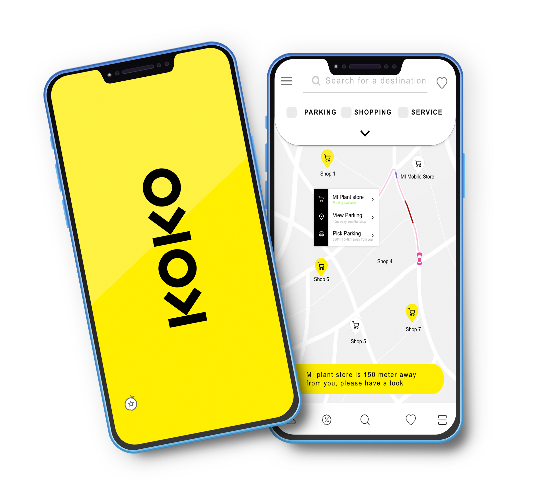
Finding a parking spot in a busy area is rarely quick. Drivers can lose anywhere from a few minutes to an hour hunting for a space that fits their car and sits close enough to where they're going — mostly because they're making decisions without reliable information about what's available.
KOKO asked me to design a mobile app that fixes this for drivers and, at the same time, gives local shopkeepers a reason to sponsor it. The app surfaces free or nearby parking around a destination, lets drivers book a slot in advance, and rewards each booking with discount coupons and redeemable points from participating stores. Target users: anyone who drives.
Of parking-app users drop off out of frustration with existing apps (public forum research)
Turns and 3 full circles observed for a single car before it found a spot
Sides to satisfy at once: drivers who want a spot, shop owners who want footfall
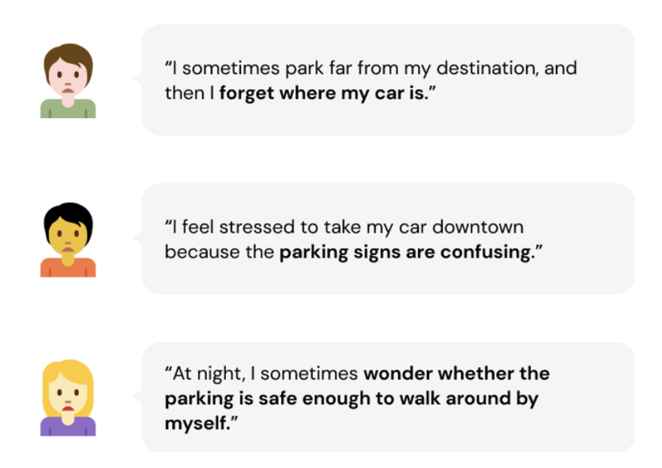
Parking is frustrating enough on its own; using an app on the move that buries the relevant information makes it worse. Forum research showed a meaningful share of drivers give up on parking apps altogether because they're hard to use under pressure.
The client's brief was to envision something more useful than a map of spaces: an app that helps drivers find the right spot while giving store owners a channel to offer discounts that bring those drivers into the shop. On top of that core loop they wanted advance slot booking, round-the-clock camera monitoring of parked vehicles, and valet parking.
A three-month plan running discovery, strategy, design, build and launch-and-learn as overlapping tracks, so development could start on validated flows while later screens were still being explored.
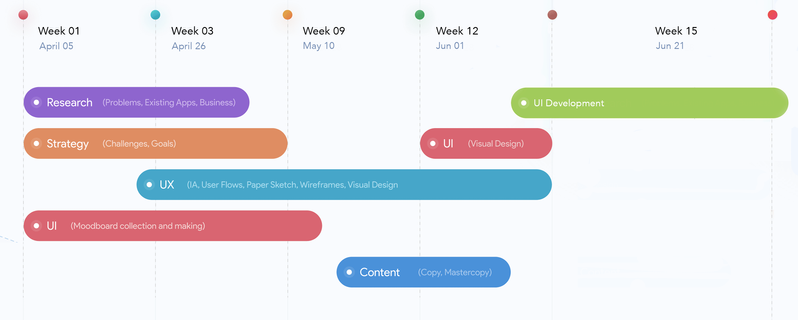
A startup client, a single designer and four engineers, and a three-month window. Leadership here meant setting a plan the whole team could see, making the hard scoping calls early, and keeping the founders' ambition tethered to what users actually needed.
Translated the founders' vision into a three-month roadmap with overlapping discovery, design and build tracks and three release gates.
Designed and ran observation, interviews and competitor analysis; converted findings into an insights map the whole team worked from.
Facilitated workshops with the founders and PO, negotiated MVP scope against a long feature wish-list, and ran client demos every release.
Owned hand-off quality, sat in sprint planning with four developers, and closed the loop from each release's feedback into the next.
Discovery began with the business: what problem KOKO was solving, what its objectives were, and what made the brand distinct. From there I studied the market, analysed the competition and set out to understand drivers' needs and pain points first-hand.
To ground the survey questions in real behaviour I spent time watching high-traffic parking areas — deliberately covering different parking types (garages, multi-level structures, open lots, and street parking). I timed how long drivers took to find a spot and to pay, and noted their driving patterns. One car alone made more than twelve turns and three loops before parking, then queued five minutes to pay.

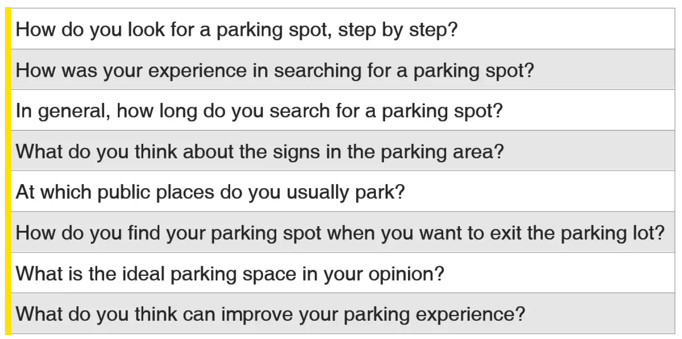
To go deeper on the day-to-day problems, I interviewed five private car owners who drive daily to college or the office. The transcripts were rich but scattered — a reminder that raw interview data needs structured synthesis before it yields conclusions.
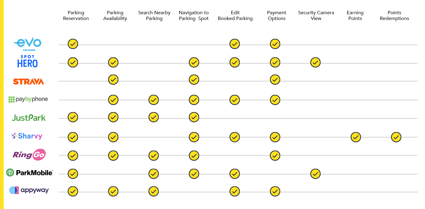
I benchmarked the parking apps already on the market and compared the ones with elements closest to KOKO's ambition. ParkMobile and RingGo came nearest to the target — map views of availability, navigation and reservation. PayByPhone informed pay-for-a-spot and extend-stay; SpotHero the reservation model; Strava's mapping and Sharvy's kudos, badges and stats shaped the community and rewards thinking. Google Maps set the bar for wayfinding.
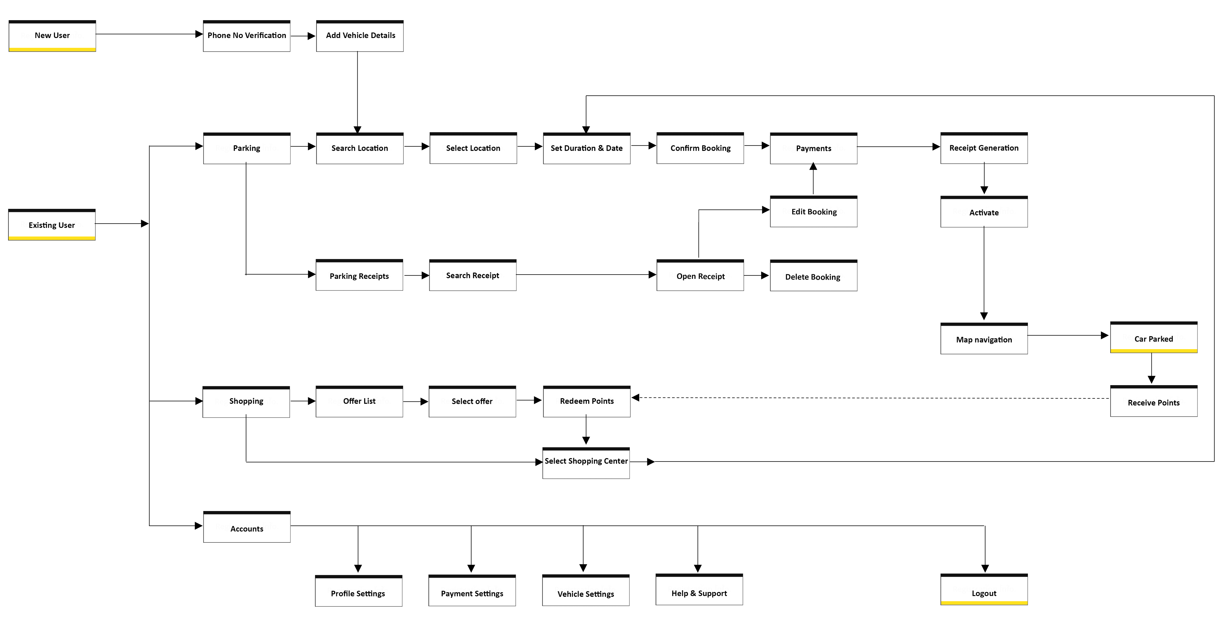
Strategy set the goals, determined the feature set and estimated the scope that would deliver the best business impact. It combined brainstorming with the research outputs — personas, user stories, an empathy map and a customer journey map.
Workshops, observation, online research and the interviews together gave a clear picture of how people park, what gets in their way and what they expect. Everything was plotted onto a single insights map.
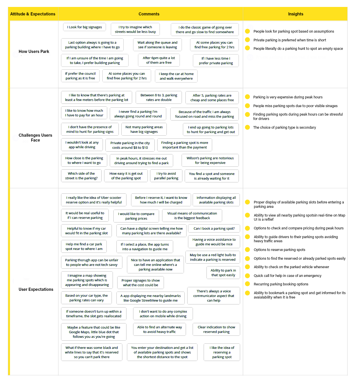
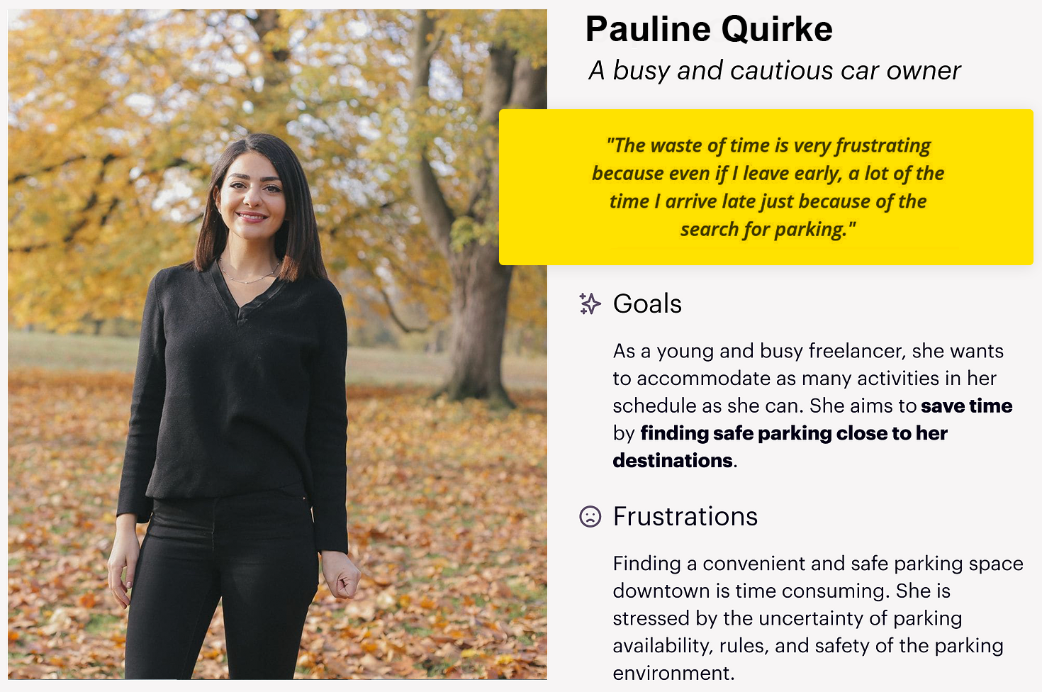
City parking is stressful because drivers decide without full knowledge of safety, rules and availability. From the insights I built a primary persona, Pauline: a busy, cautious car owner who often drives downtown and wants safe parking close to her destination, but loses time to street parking and confusing signage.
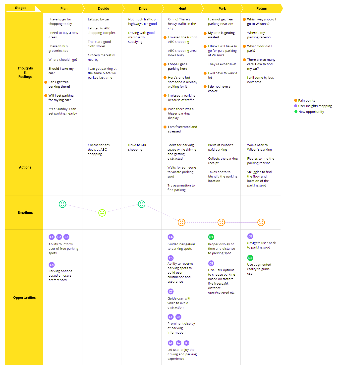
A current-state journey map exposed every friction point and opportunity, and became the source for the feature enhancements proposed to the KOKO team.
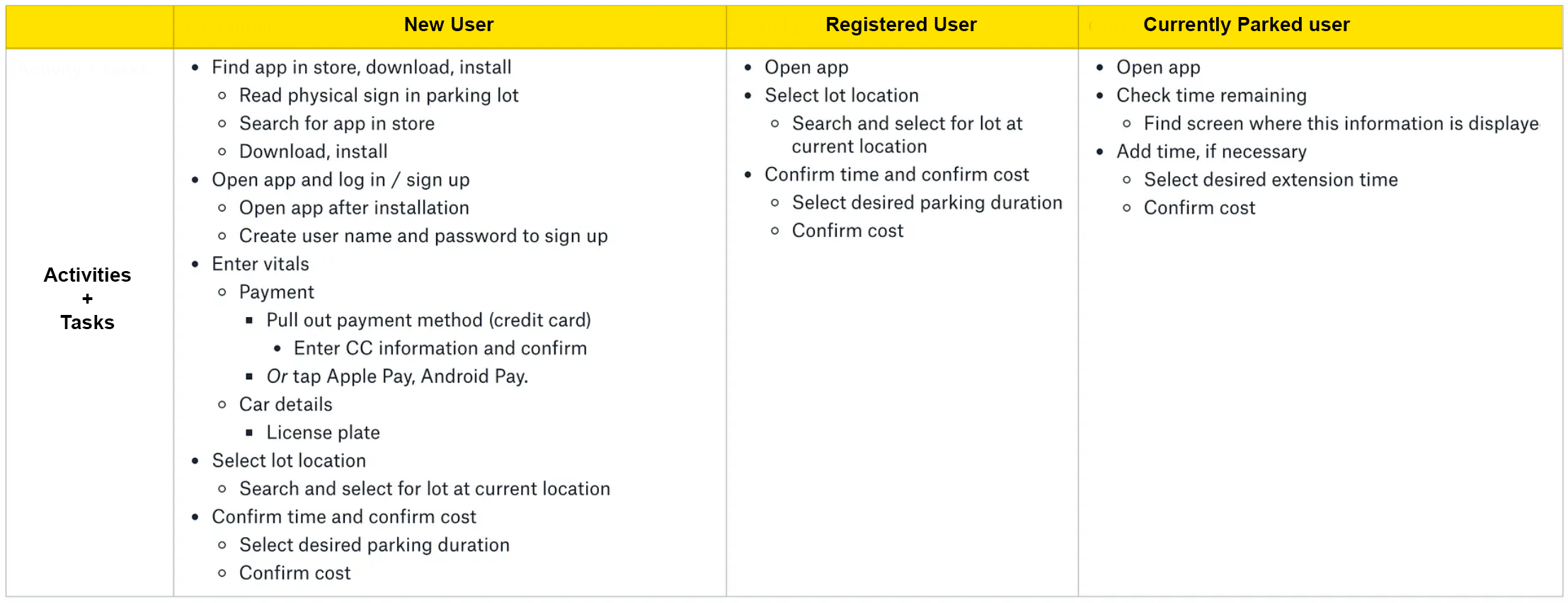
Tasks are the atomic units of activity — the taps, drags and scrolls. I listed them abstractly, referencing motions rather than UI widgets, so they could drive flows without pre-deciding the interface.
I whiteboarded the flows and structure, deliberately giving users more than one route to each goal, each tailored to the high-level journeys uncovered in research.
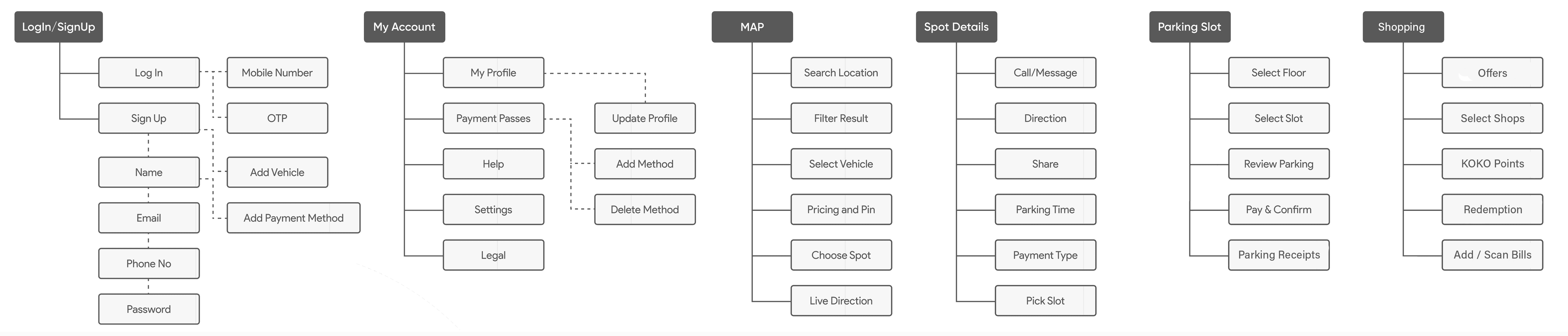
With the feature list mapped to pain points, a detailed IA laid out where each capability would live — giving the whole team a shared view of how the platform fits together and where to focus.
The founders' brief included advance booking, 24/7 camera monitoring and valet parking on top of the core find-and-book loop. I ran a MoSCoW session with the PO and dev lead to agree what three months could prove, and parked the rest on a dated roadmap rather than saying no.
Show availability count and location clearly; confirm the booking with a clear reference the driver can show at the gate.
Every new idea mapped to the journey map and the release plan in the weekly check-in — visible, dated, and never lost.
Component library plus annotated specs so engineering never blocked on design; same-day answers in stand-up.
Large touch targets, high-contrast map pins and one primary action per screen, tested on mid-range Android devices.
With research and objectives in hand, design focused on getting drivers to their goal as quickly as possible with as little friction as possible.
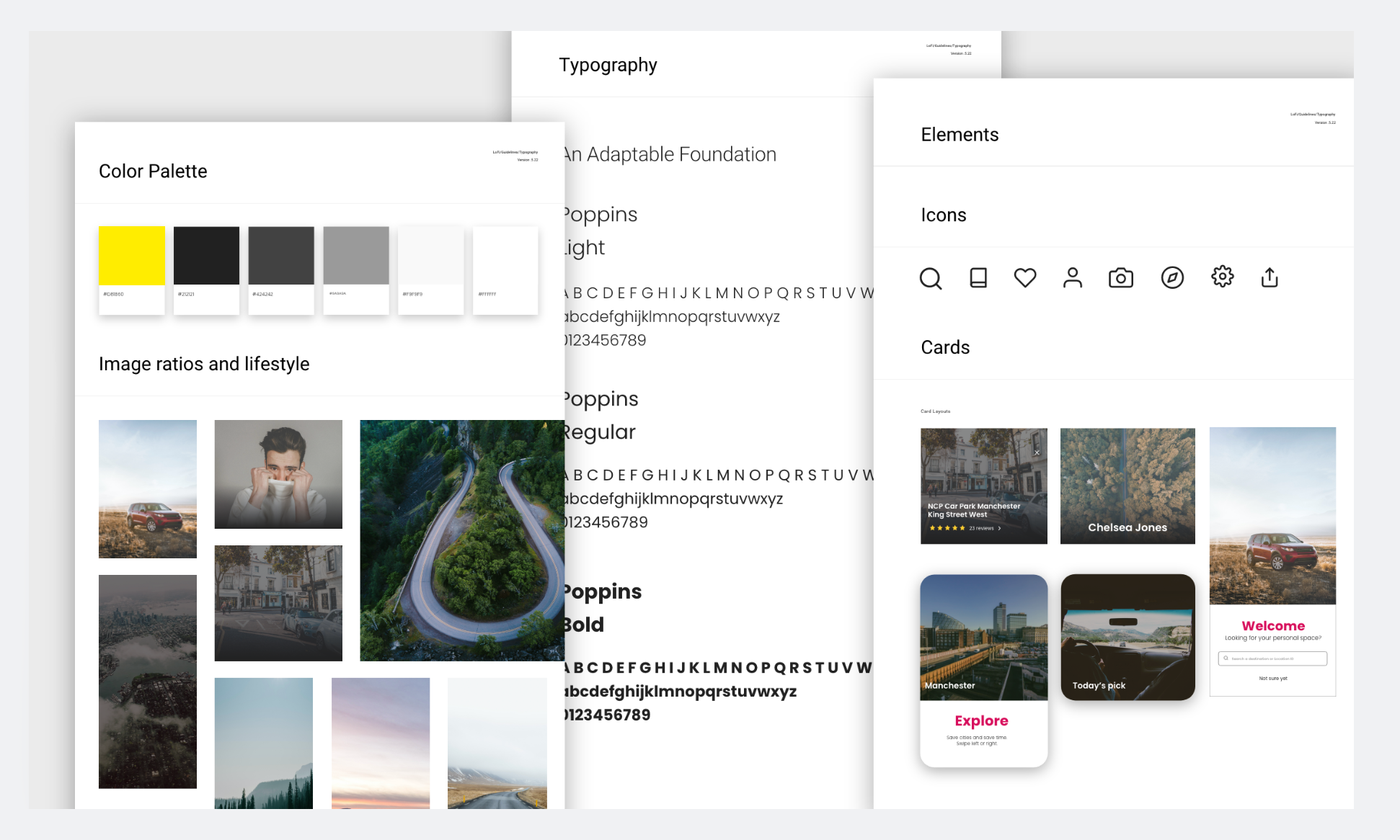
Every component was built to be compatible and reusable within the KOKO style guide, with a minimum of WCAG AA accessibility across the application — contrast, touch targets and legibility checked for use on the move.
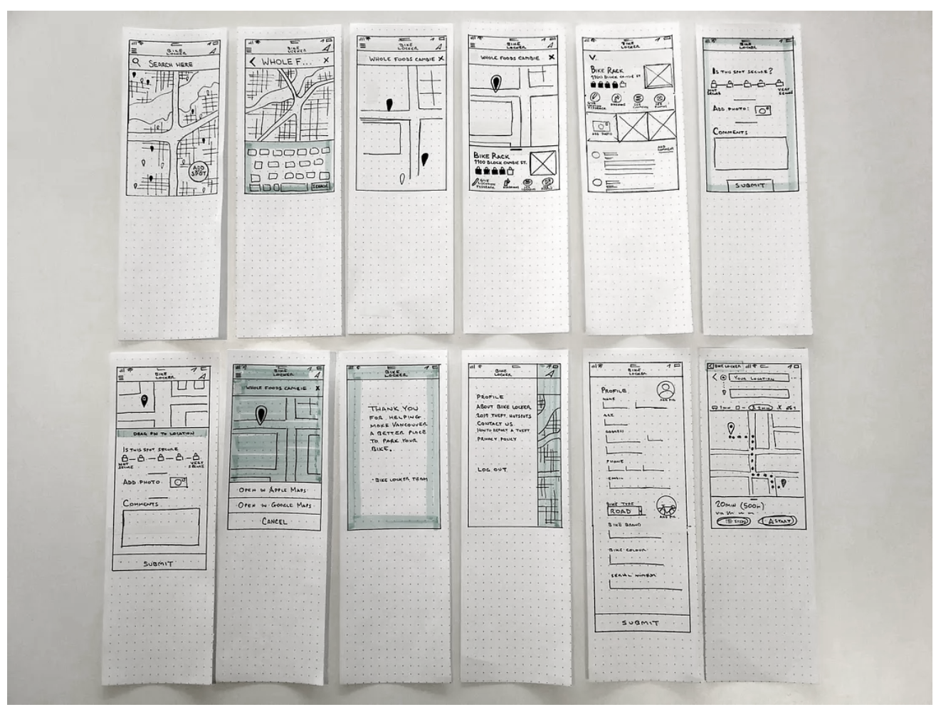
To get ideas flowing I sketched a series of paper prototypes. These lo-fi artefacts made it cheap to test and iterate before committing to screens.
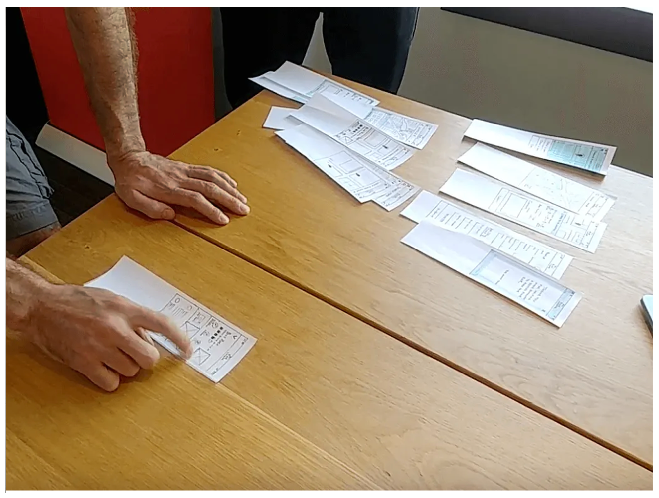
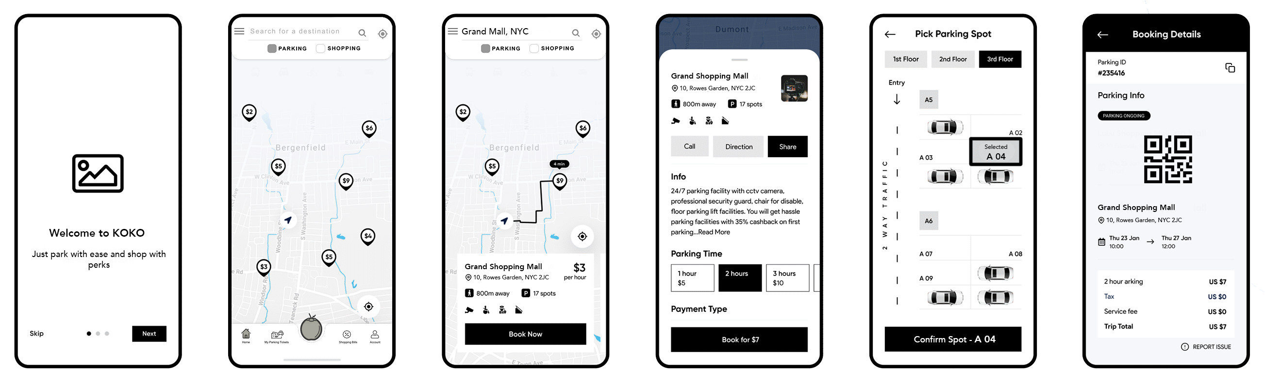
Key screens were worked up in low fidelity to find the most usable and scalable structure. After testing and refinement, a unified layout emerged that flexed across user types and use cases.
Parking space booking
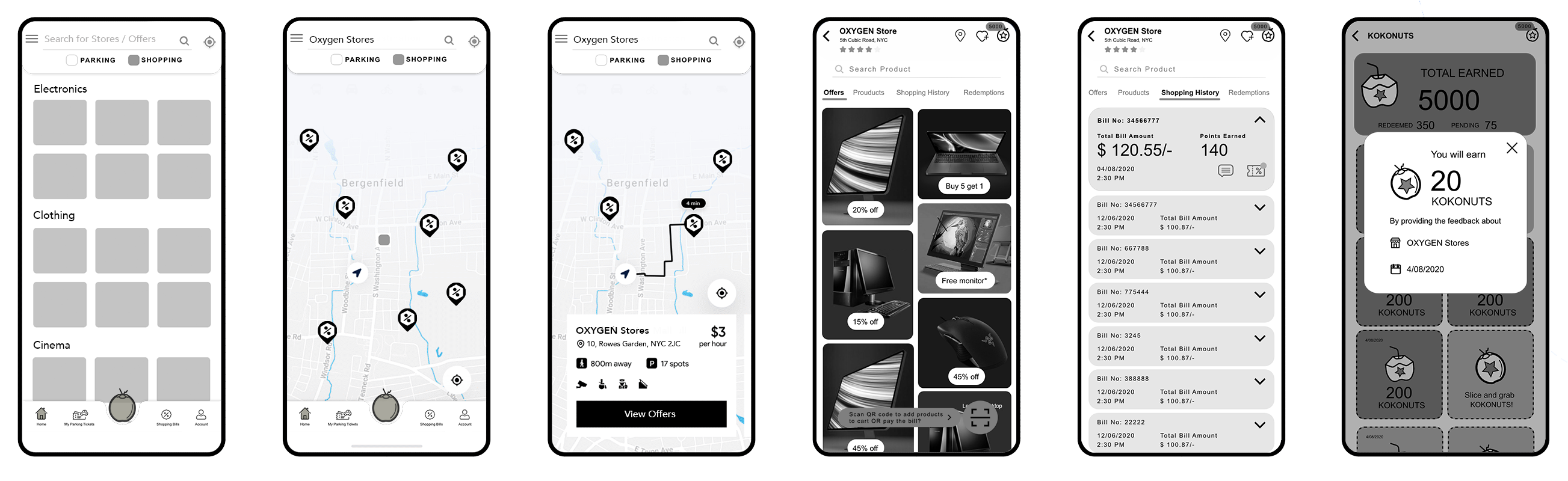
Offers and points redemption
After stakeholder sign-off on the wireframes, designs were handed to the four-developer team building the MVP. Development ran in three releases prioritised by user story; each release was tested and the feedback rolled into the next.
Once the lo-fi wireframes had been tested with users and the flow finalised, hi-fi wireframes and visual design were produced and delivered for development.
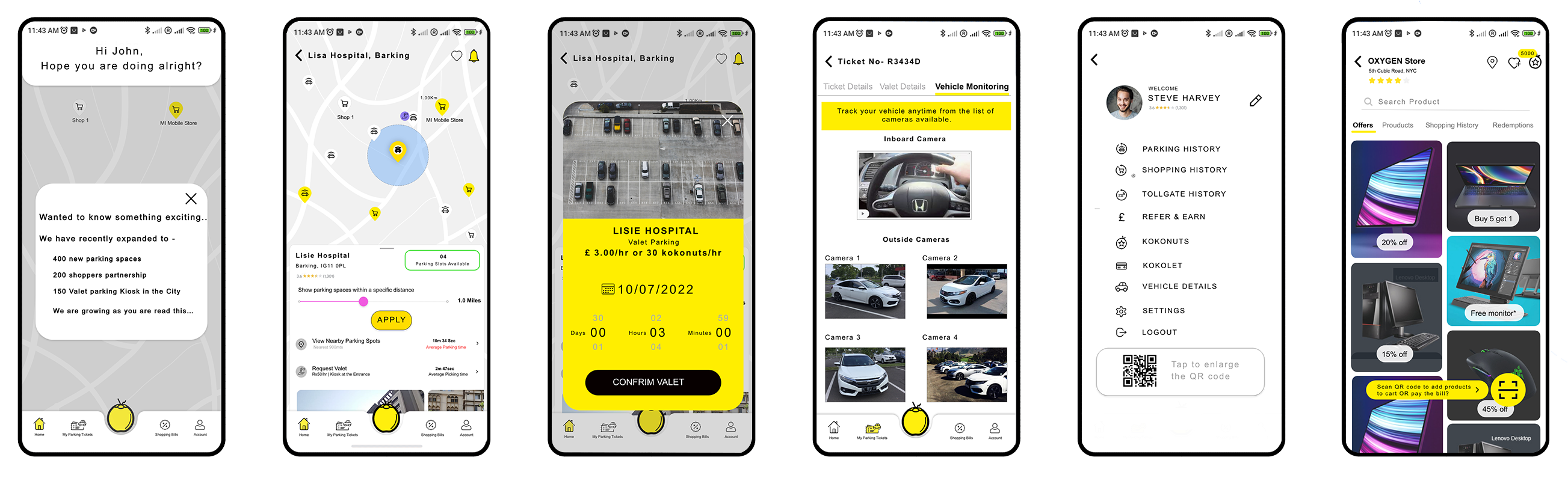
Ideal spots ranked by distance to the destination, availability and safety.
Check the rules for a spot without deciphering confusing signage.
Shared parking experiences improve future availability predictions.
Your spot is saved automatically with a countdown based on the vehicle's location.
Live parking and road conditions so drivers can route around trouble.
Relevant store offers surfaced by proximity to where you've parked.
Design is never finished. Once real users had the product, we reviewed performance, gathered feedback and improved against both user needs and business goals.
I assembled a prototype to surface usability issues. Even with limited functionality, participants could grasp each screen's structure and flag anything that would hurt the experience. Findings were clustered in an affinity map, prioritised, and fed back into navigation and other areas.
Before the first release I agreed a small scorecard with the PO so each drop could be judged against the problem we were hired to solve — drivers abandoning parking apps out of frustration — rather than against feature count.
| Level | Metric | Why it matters | Signal by release 3 |
|---|---|---|---|
| North star | Bookings completed without support contact | The app works on its own, in the car | Steady rise across the three drops |
| Adoption | Installs & repeat bookings | Proves the value loop for drivers and shops | 10K+ installs on Google Play |
| Usability | Task success & SUS per release | Benchmarkable against industry (68) | Above benchmark by release 3 |
| Delivery | Design defects raised in QA | Hand-off quality with four developers | Falling release over release |
Listening to customers and would-be customers is everything. Understanding how they think and feel made it possible to empathise and design for the problems they actually have. Most of those problems aren't new — plenty of parking apps already ship these features. The point was never to reinvent the wheel but to listen closely enough that the experience becomes obvious and users don't have to think.
And it doesn't end at launch: shipping the MVP to real people is what validates the assumptions and answers the questions users still have. Further iteration towards delight is the path from here.
I hired Abraham to lead our UX effort and couldn't have been happier. I have found him to be personable, professional, hard working and dedicated to his craft. His work was invaluable to creating a better product. His studies on product usability showed us in concrete terms just how much we misunderstood our customers and how poor our UI design choices were. He showed us where we had gaps in our understanding and guided our team to create a far more user friendly and effective product.
I've had the pleasure of collaborating with Tinton on a couple of projects. Tinton is a passionate, dedicated and talented UX designer with strengths in creative and strategic thinking. He impressed me with how well he connected with engineers and has always been keen to learn more about the technical architecture of the systems. Tinton's work is intuitive and captures the client's needs while being firm on designing the right solution without shortcuts. Keep up the good work.

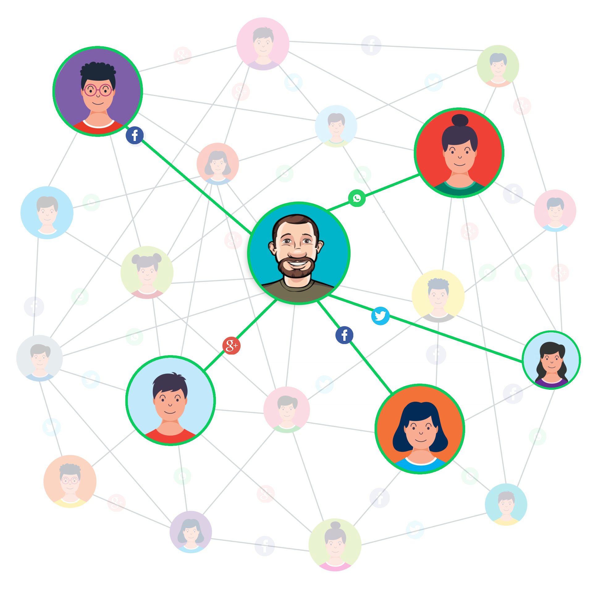
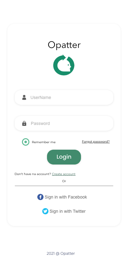
Opatter is a social decision-making app: photograph the item you're hesitating over and get an instant "Awesome" or "Meh" from the five friends who know you best. I led the engagement end to end — owning the research plan, product strategy and design direction, running the stakeholder pitch, and coaching a business analyst and a visual designer to a tested MVP on an eight-week clock.
Stakeholder brief, market & competitor scan, observation, interviews
Persona, empathy map, journey, task flow, MoSCoW scope
Lo-fi wireframes, style guide, hi-fi screens & interactions
Feasibility with engineering, spec & hand-off, MVP
Two usability rounds, SUS, decision log, iterate
This was a small, fast engagement — exactly the kind where leadership shows up as clarity, sequencing and coaching rather than headcount. I set the plan, made the calls, and made sure the team learned while shipping.
Framed the problem, wrote the value proposition, and scoped an MVP the team could test in eight weeks — not a feature wish-list.
Designed the research plan, interview guide and participant criteria; ran synthesis workshops so insights were shared, not siloed.
Built and delivered the idea pitch to leadership; negotiated scope with the BA and feasibility with engineering before design began.
Ran twice-weekly critiques, paired the visual designer on hierarchy and components, and set the definition of done for every deliverable.
Staying close to a few people keeps us grounded in every part of life. Social media optimises for a large network; decisions that matter lean on a small one. The research set out to quantify that gap and understand how the target users actually stay connected.
Social media friends
Close, bonded relationships
People they share their most private details with
Source: Harvard Business Review
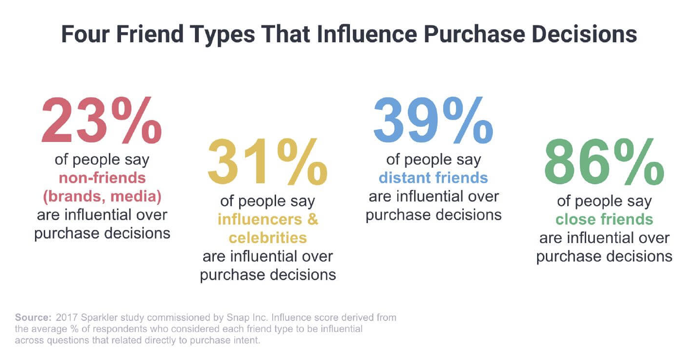
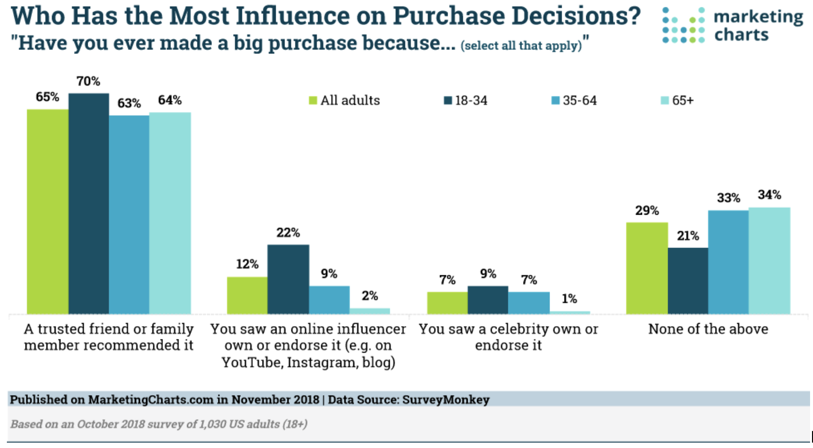
I benchmarked how existing tools help people decide while shopping. Most either lean on strangers' reviews or on slow, one-to-one chats. Nobody offered a fast, structured verdict from a small trusted circle.
| Approach | Examples | Strength | Gap Opatter fills |
|---|---|---|---|
| Crowd reviews & ratings | Amazon, Flipkart, Google Shopping | Volume of opinions | Strangers' taste ≠ yours; slow to read in-aisle |
| Messaging a friend | WhatsApp, Messenger | Trusted source | One-to-one, unstructured, easy to miss, no verdict |
| Social polls | Instagram Stories, Facebook polls | Fast, visual | Broadcast to everyone; no response deadline |
| Visual discovery | Pinterest, style apps | Inspiration | Helps browse, not decide on the item in hand |
| Opatter | — | Five trusted friends, timed, binary verdict | Decision in minutes, in the store |
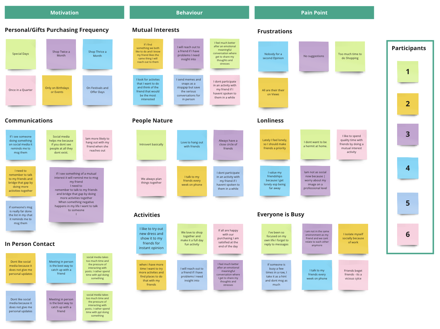
Uncover the motivations and pain points in how Gen Z and Millennials connect with the people closest to them, and how they prioritise and maintain those relationships. Interviews ran 30–40 minutes, in person or by phone.
Ages 11–46, building a full-time career, have felt disconnected from friends, value social relationships, tech-savvy, and use at least one social platform to keep in touch.
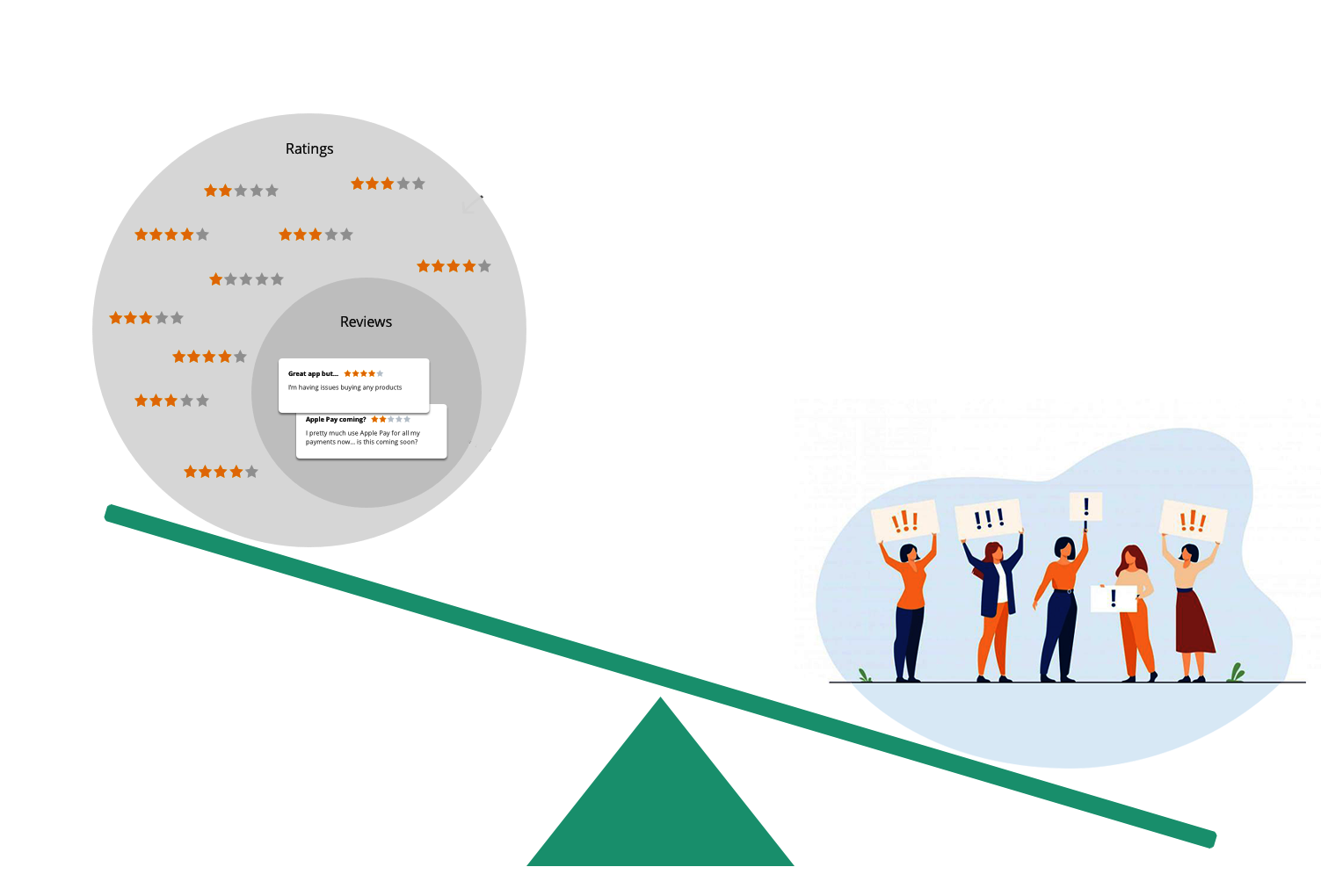
Published research backs the hunch: the volume of reviews from friends shapes following behaviour far more than the crowd's. Crowd valence and variance showed no effect once friend reviews were ignored — and a negative one when they were included. In short, the influence people attribute to reviews mostly comes from reviews by friends.
Source: ScienceDirect, "Friend reviews vs. crowd reviews" (2018)


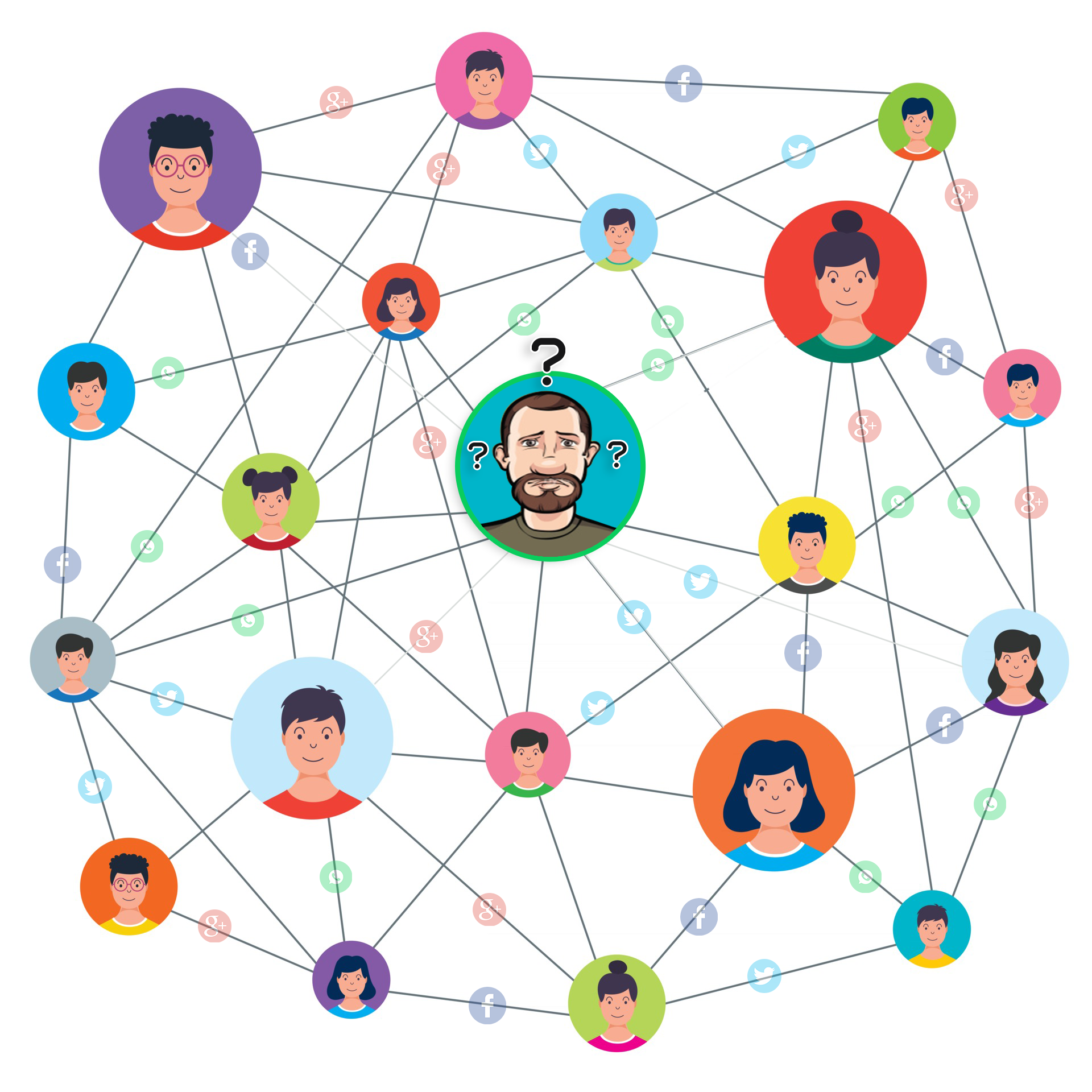
Synthesising interviews and research into pain points and opportunities produced a behavioural persona, John, which set the direction for the solution's intent and core needs.

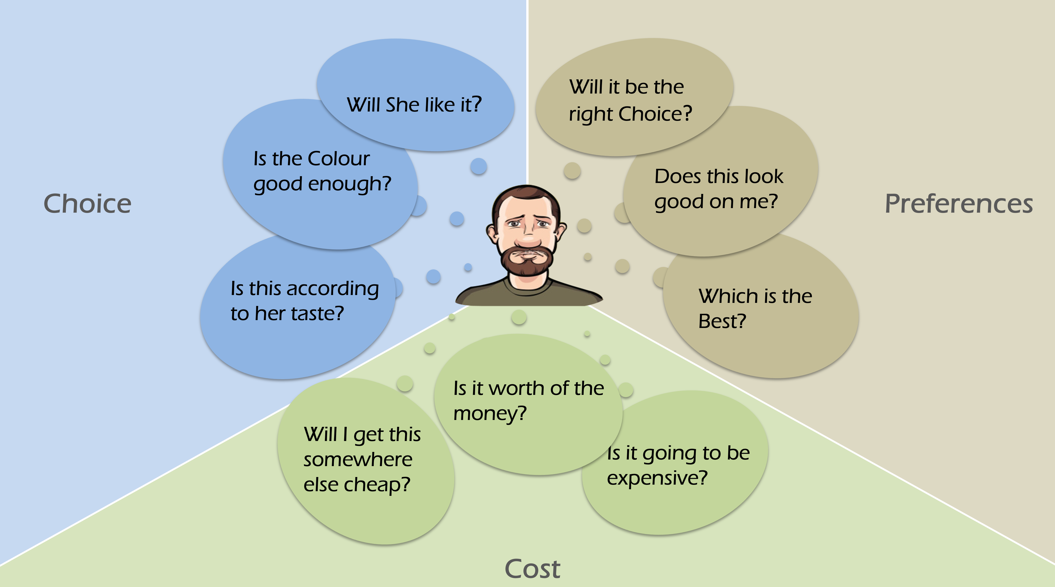
An empathy map captured the concerns and confusions running through John's head at the point of purchase.
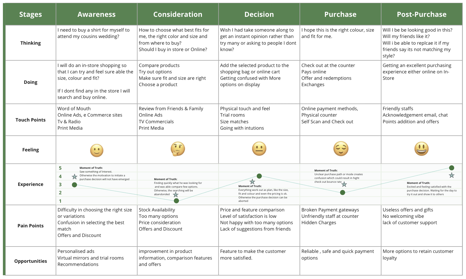
Plotting John's experience end to end showed exactly where a digital intervention could relieve the most friction.
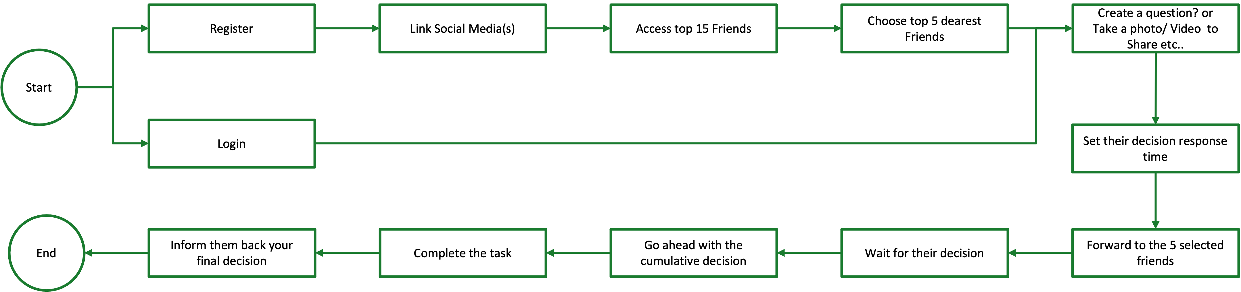
With a fixed eight-week window, I ran a MoSCoW session with the BA and engineering to agree what a testable MVP actually needed. The rule: if a feature didn't help a user reach a verdict faster or trust it more, it waited.
Only the user's top-20 interactions are read, and only the five they choose are ever contacted. Nothing posts without an explicit send.
User-set response time plus a visible countdown so a silent friend never blocks a decision; partial results shown at timeout.
Friends vote independently and don't see others' answers until the asker does, protecting honest opinions.
Weekly stakeholder demos and a written decision log kept scope honest and made every trade-off visible early.
Key screens were explored in low fidelity to find the most usable, scalable structure. Testing and refinement shaped a unified layout that works across user types and use cases.
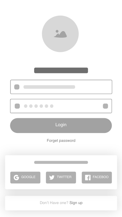
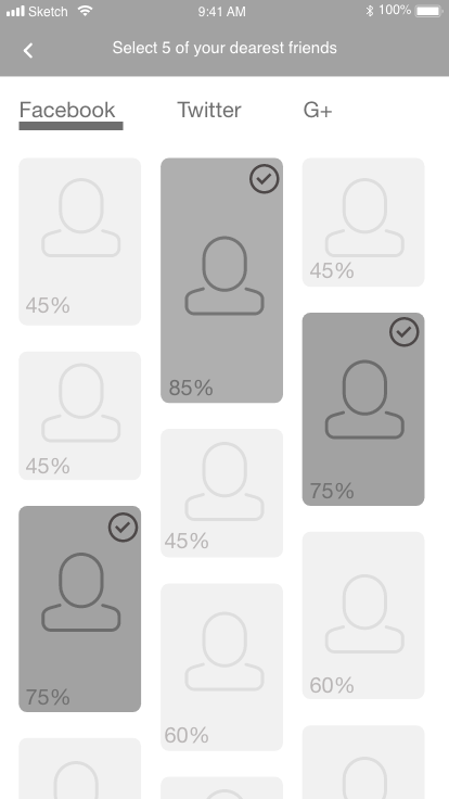
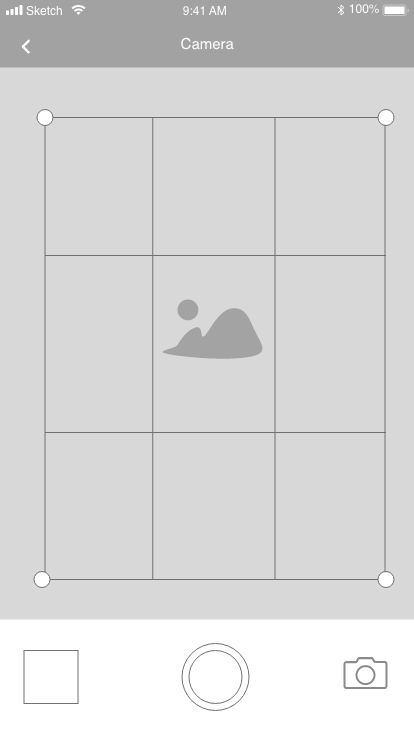
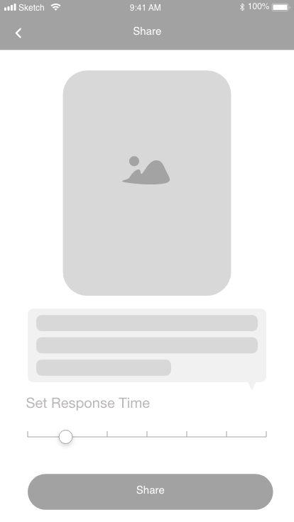
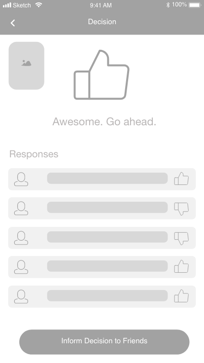
Lo-fi sketches locked hierarchy, design goals and component choices before the visual layer was applied against the Opatter style guide.
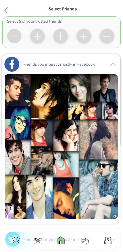
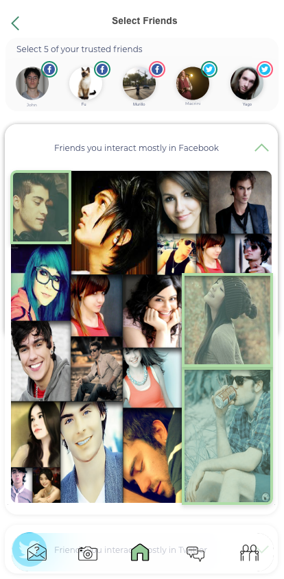
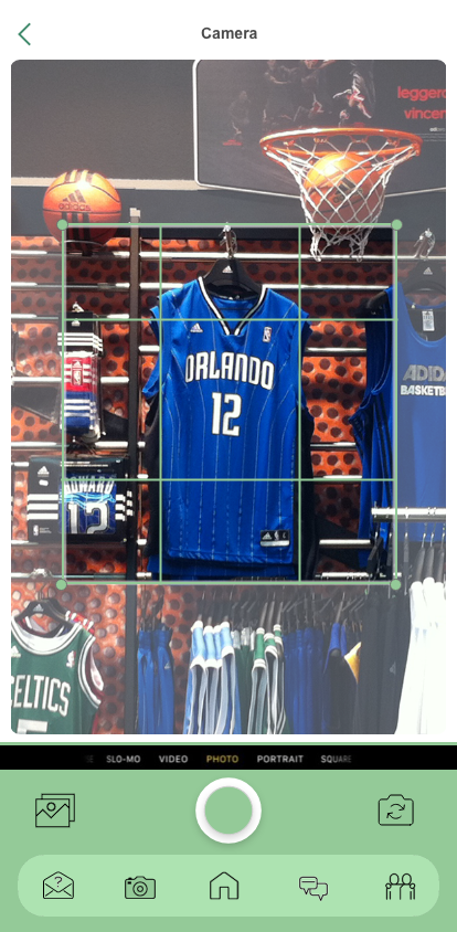
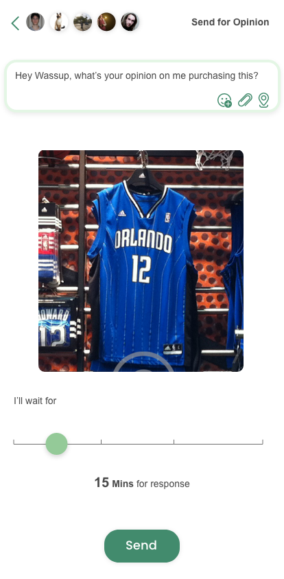
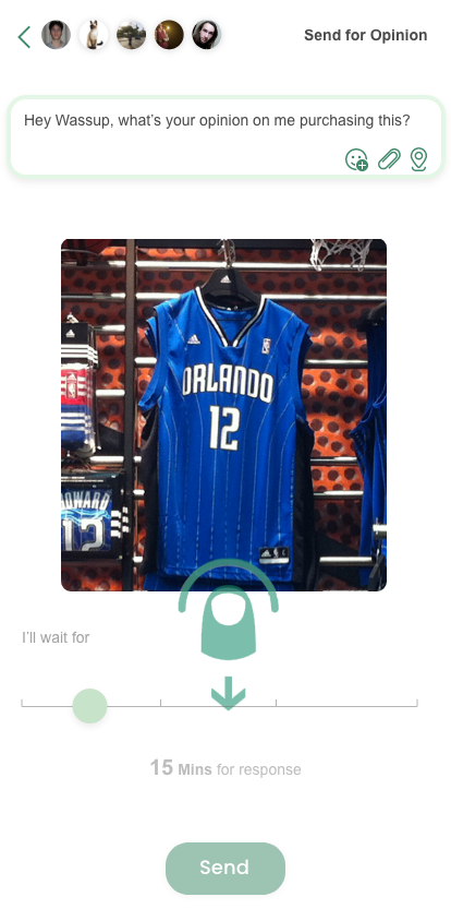
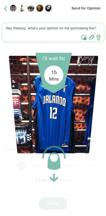
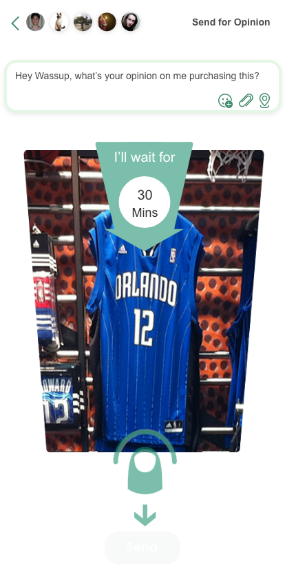
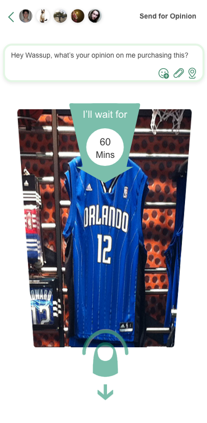
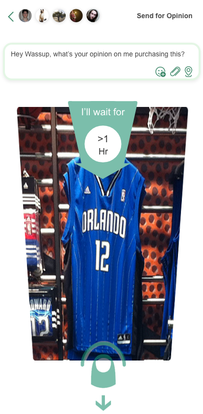
An alternative, one-thumb way to ask: drag the image down and it stretches like a rubber band, setting the response time as it goes. Release, and it flies to your friends.
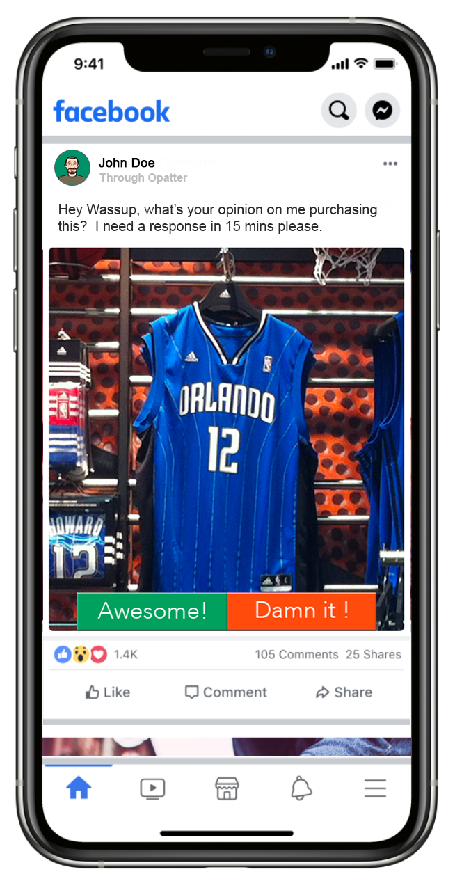
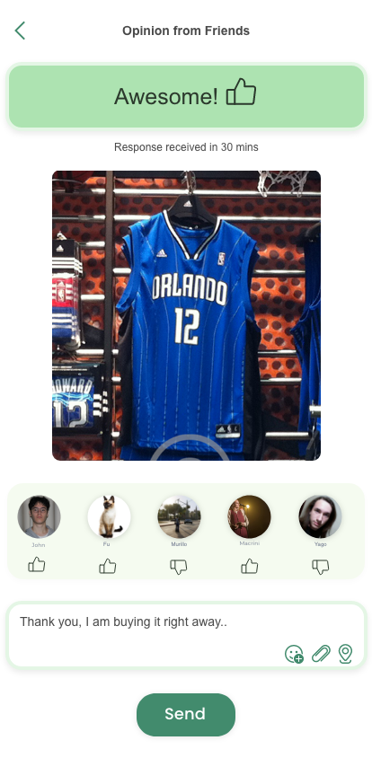
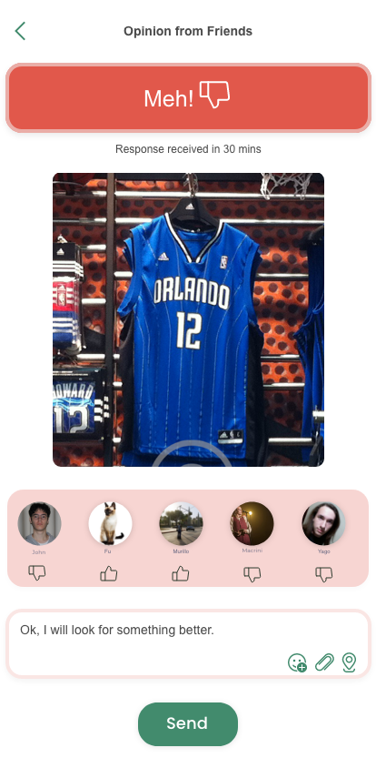
The MVP prototype was tested in two rounds with participants matching the persona, in simulated in-store scenarios: choose a gift, then choose something for yourself. Alongside task success I measured decision time, self-reported confidence, and a System Usability Scale score.
Before testing I defined what "working" meant, so results could inform a go / no-go rather than a debate. One north-star, three supporting signals, tracked round over round.
| Level | Metric | Why it matters | Round 1 → 2 |
|---|---|---|---|
| North star | Decisions completed with a friends' verdict | Proves the core loop, not just the UI | 6/10 → 9/10 |
| Speed | Snap-to-sent time | Must fit an in-aisle moment | 2m10s → <90s |
| Confidence | Self-rated confidence after verdict (1–7) | The value proposition is confidence | +1.4 → +2.1 |
| Usability | System Usability Scale | Benchmarkable against industry (68) | 63 → 74 |
By grounding every decision in user needs and best practice, the idea-pitch app delivered an onboarding and decision flow that built trust with new users and communicated its benefits clearly. The iterative loop of research, design and testing produced an interface people found intuitive on first use.
Directed but open questions validate hypotheses. Without them, interviews drift into vague answers that never test your assumptions.
The testing phase doesn't finish when user testing does. Balancing user needs against time and resources, keep testing — it always leads to a better product.
If a design doesn't improve the experience or meet a goal, it's decoration. Stay open in testing; the hard moments are where the pivotal changes come from.
In close partnership with Intuit UX teams, I mentored and upskilled my team on Vibe Designing — a repeatable, AI-native framework that speeds up UX delivery and provides dev-ready code for engineering. Together, we synthesized PRDs, research, and stakeholder inputs via NotebookLM, generated actionable requirements and working prototypes using Claude, and systemized validated UI through Figma AI. By shifting from static mockups to fully traceable, runnable prototypes, we transformed how design collaborates with engineering. Here is a step-by-step look at the framework and its application on the TurboTax Pricing Source of Truth.

Across IES, PPM and Compliance, my team was producing good Figma work — and losing a lot of it in translation. Research synthesis took days. Static mockups left engineers guessing at states, edge cases and logic. Every "why did we design it this way?" question sent someone back through a Zoom recording. Rework arrived late, when it was most expensive.
The opportunity wasn't a new tool; it was a new operating model — what the team now calls Vibe Designing. Generative AI had become good enough to transcribe, synthesise, draft and even build. If we re-sequenced the work around those capabilities — with the designer firmly in the loop as editor and decision-maker — we could hand engineering something far more useful than a picture: a working prototype whose every element traced back to customer evidence.
Typical time from a round of customer sessions to a shareable synthesis, before the change
Of engineering clarification questions were about states and logic a mockup couldn't show
Vendors, two toolchains, one product — consistency depended on individuals, not process
Changing how eight people across two vendors work is a leadership problem before it's a tooling one. I owned the operating model, the guardrails that made it safe inside a regulated financial-software company, and the upskilling that made it stick.
Authored the Vibe Designing framework — evidence → insight → requirement → prototype → system — and the gates between stages.
Agreed with security and legal what can enter which tool; set the PII-redaction and human-review rules every artefact follows.
Won engineering and PM buy-in by piloting on one feature, measuring, and letting the numbers make the case.
Ran weekly prompt-and-prototype clinics; paired every designer through their first vibe-coded prototype.
Vibe Designing is the name my team gives to designing with generative AI as a disciplined, evidence-first practice — not prompting for pretty screens. Every run starts from the same inputs, moves through the same eight steps, and ends with a working prototype, a decision log and system components. The framework is tool-agnostic in principle; today it runs on Zoom, NotebookLM, Claude and the Figma AI suite.
The pipeline below is the spine of the framework — every input on the cards beneath it enters at the first node and leaves engineering as a runnable prototype with its evidence attached.
Agree the outcome with PM and PD, then assemble every relevant input — PRDs, mocks, meeting recordings, brainstorm boards, tickets — into one evidence set. Decide the north-star metric before anything is generated.
Record Zoom sessions with PD, PM, stakeholders and customers (with consent). Generate transcripts, redact names and account data, and tag each recording with its purpose so quotes stay attributable.
Load the evidence set as sources. Interrogate it: pain points, jobs, constraints, contradictions between documents and conversations. Produce a cited insight brief, a current-state journey and open questions — every claim linked to a source.
From the brief, generate user stories, acceptance criteria, states and edge cases. The designer edits line by line; nothing passes without a linked citation. Open questions become explicit assumptions in the spec.
Prompt Claude to build a working prototype in code on the design-system tokens — real states, validation, data shapes. Iterate in minutes, not sprints. The prototype is the spec: logic lives in it, with a short decision log alongside.
Walk the working prototype in a Zoom review before any visual polish. Capture decisions and objections into the log; loop back to steps 3–5 as needed. Peers brainstorm alternatives against the same evidence.
Test the prototype with target users on real tasks. Measure task success, time and confidence; re-run the generation loop on what fails. Findings go back into NotebookLM as new sources.
Convert the validated prototype into components, variants and documentation mapped to the Intuit design system. Hand engineering the prototype, the spec, the decision log and the system components together.
| Stage | Tool | What it does for us | Guardrail |
|---|---|---|---|
| Capture | Zoom recordings & transcription | Every session becomes searchable text the same day; verbatim quotes survive into the spec | Consent captured; names and account data redacted before anything leaves Zoom |
| Synthesise | NotebookLM | Grounded Q&A across dozens of transcripts; insight briefs, personas and FAQ with source citations | Only redacted sources; outputs checked against citations by a second designer |
| Specify & build | Claude | User stories, acceptance criteria, edge cases, then a working prototype in code on our tokens | Approved enterprise workspace; no customer data in prompts; designer owns every decision |
| Systemise | Figma AI suite | Prototype to components fast; variants, auto-layout and docs generated and curated | Everything mapped to the Intuit design system before publishing |
Speed is the easy part of designing with AI. The hard part is staying trustworthy, consistent and honest while moving fast. These are the practices I hold my team to — and the ones I ask engineering and product partners to hold us to. They are written as rules on purpose: a framework is only as good as the discipline around it.
Guardrails are what turn an experiment into a practice an enterprise can trust. In a regulated financial-software company they are also the licence to operate: security, legal and compliance said yes to Vibe Designing because the rules were written down first.
Only approved enterprise workspaces. Customer names, account data and financial figures are redacted before a transcript or document enters any tool. Nothing confidential in a prompt — ever.
AI drafts; a designer decides; a peer reviews. No generated requirement, copy or prototype reaches a stakeholder without a named reviewer and a reason it was accepted.
Every insight carries a citation to a source; every requirement links to the insight. If a claim can't be traced, it's treated as a hypothesis and labelled as one.
Prototypes, drafts and syntheses are marked as AI-assisted and as prototype-grade. Engineering owns production code; the prototype is the spec, not the shipment.
Three reasons, in the order leadership cares about them. Trust: one leaked customer detail or one confidently wrong requirement would end the programme and set AI-assisted design back years. Speed: teams move fastest inside clear boundaries — nobody pauses to ask "am I allowed to?" when the answer is written down. Scale: rules let eight people across two vendors behave as one team, and let a new joiner be productive in a week.
| Guardrail | What it means in practice | How it's enforced | Owner |
|---|---|---|---|
| Approved tools only | Enterprise Claude, NotebookLM and Figma workspaces with no training on our data; consumer tiers are off-limits | SSO-only access; tool list reviewed quarterly | Security |
| Redact at source | Names, emails, account IDs, pricing figures and anything contractual are removed before transcripts or docs leave Zoom or Drive | Redaction checklist on every source; spot-checks in the monthly review | UX lead |
| No confidential data in prompts | Prompts describe structure and intent; real customer or financial data is never pasted in | Prompt templates with placeholder fields; peer review of shared prompts | Every designer |
| Human sign-off | A named designer approves every generated requirement, copy block and prototype before it reaches a stakeholder | Reviewer field in the decision log; nothing shared without it | Designer + peer |
| Cite or label | Every insight points to a source; anything untraceable is labelled a hypothesis | NotebookLM citations checked; "hypothesis" tag in the spec | Designer + peer |
| Prototype ≠ production | Prototypes are labelled AI-assisted and prototype-grade; engineering builds production from the spec | Banner in every prototype; handoff checklist | UX lead + Eng |
| Bias & harm check | Generated personas, copy and defaults are reviewed for stereotyping, exclusion and dark patterns | Inclusive-design checklist in critique | Critique group |
| Log exceptions | Any near-miss or breach is recorded and discussed, not hidden | Monthly tooling retro with security | UX lead |
A vibe-designed prototype that ignores the design system is just a faster way to create rework. We give the models the system up front so what they generate is already ours.
Design tokens, component specs and content guidelines are loaded as sources in NotebookLM and attached to Claude as project knowledge, so colour, type, spacing, states and tone are inherited — not reinvented.
Prompts reference named components ("use the IDS data table with inline edit") rather than describing visuals. If a pattern doesn't exist, that becomes a design-system conversation, not an improvised one.
WCAG 2.1 AA, Intuit's content voice and localisation rules are part of the acceptance criteria generated in step 04 — so they're checked in review, not discovered in audit.
Anything validated and new goes through the Figma AI suite into the system backlog with its evidence, so the next team starts from a component, not a prototype.
Don't improvise in the prototype. Raise it as a design-system proposal with the evidence attached, prototype it as a clearly labelled candidate, and let the system team decide. The TurboTax approval-state pattern (Proposed → Finance Review → Approved → Applied) went through exactly this route and is now a shared component rather than a one-off.
Vibe Designing raises the bar on craft rather than lowering it. The model can draft; it cannot know what matters. These are the skills I hire for, coach and protect in the team.
| Skill | Designer | Senior | Lead |
|---|---|---|---|
| Research & synthesis | Runs a session; checks citations in a brief | Designs the study; spots unsupported claims | Sets the research plan and evidence standard |
| Prompt & context design | Uses shared skills and templates | Writes new skills; supplies the right sources | Curates the skills library; sets guardrails |
| Reading & shaping code | Reviews states and copy in a prototype | Adjusts logic and tokens; pairs with engineers | Judges feasibility and handoff quality |
| Systems & design-system fluency | Uses the right component | Proposes patterns through the system | Owns the relationship with the system team |
| Content design | Edits generated copy to voice | Writes terminology and acceptance criteria | Sets content standards for the team |
| Facilitation & critique | Presents evidence clearly | Runs reviews where evidence decides | Aligns PD, PM and stakeholders on trade-offs |
The failure mode of AI-assisted work is quiet confidence. The antidote is a culture where asking is faster than guessing, and where the tools themselves are made to surface uncertainty.
Interrogate NotebookLM before asserting: "What contradicts this?", "Which sources say this?", "What did Finance actually say?" If the brief can't answer, go back to the people.
Prompts require Claude to list assumptions, open questions and confidence per requirement. Low-confidence items are flagged in the spec, never silently filled in.
Open questions have an owner and a date. On TurboTax, "where does pricing live in PPM?" and "how many simultaneous editors?" were raised in week one, not discovered in build.
Weekly Vibe Designing clinic and a "stuck?" channel with a same-day answer norm. Nobody loses a day to a prompt that won't behave or a pattern they're unsure of.
Asking is cheap; the cost is a message. Guessing is expensive; the cost is a sprint. The team's norm — ask within the hour rather than guess for a day — exists because AI makes guessing feel safer than it is.
Start from the outcome and the evidence set, never from a prompt.
Redact first. Nothing confidential enters any tool.
Cite or label it a hypothesis.
Prompt from the design system; propose new patterns through it.
Review the working prototype before any polish.
Make assumptions and confidence visible in every spec.
Ask within the hour rather than guess for a day.
Hand off prototype + spec + decision log + components together.
Craft gates don't move: critique, accessibility and content review stay mandatory.
Phase 1 of a programme to replace TurboTax's spreadsheet-based pricing workflow with a single, trusted pane of glass in PPM, for Consumer Group Pricing Ops, CG Strategy and Finance. The evidence set: the UX & Design Requirements deck, the existing Google Sheet workflow and PPM screens, Zoom working sessions with PD, PM, Pricing Ops and Finance partners, two peer brainstorms, and a short set of operator interviews.
A one-minute screen recording of the prototype being vibe-designed in Claude — requirements in, working PPM dashboard out. Watch the unified price view, the four-state finance approval flow, inline editing with record locking and governed sharing take shape.
Discovery to a validated, engineering-ready prototype took nine working days, against roughly four weeks on the previous Figma-first model for comparable PPM work.
Redaction before transcripts move; enterprise workspaces with no training on our data; monthly review with security.
NotebookLM citations checked by a second designer; Claude outputs reviewed line by line before they become stories.
Prototypes are labelled and scoped; engineering owns the production build; the prototype is the spec, not the shipment.
Critique stayed weekly; clinics paired fast adopters with sceptics; design quality gates unchanged.
I agreed a scorecard with PM and engineering before the pilot so the process was judged on delivery outcomes, not on how novel the tools felt. Measured across IES, PPM and Compliance work over two quarters.
| Level | Metric | Why it matters | Movement |
|---|---|---|---|
| North star | Features engineering-ready per quarter | Throughput of validated, buildable work | +30% turnaround |
| Quality | Design-related clarification tickets & rework | Did the handoff actually get clearer? | −15% rework cycle time |
| Speed | Session-to-synthesis; brief-to-prototype | Where the hours went before | 3 days → 4 hours; weeks → days |
| Adoption | Designers shipping vibe-coded prototypes | The process only works if everyone uses it | 8 of 8 within one quarter |
| Safety | Data-handling exceptions logged | Licence to keep operating | Zero |
The tools mattered less than the order. Evidence → spec → prototype → system is what removed the rework, not any single model.
Agreeing data rules with security up front turned a potential blocker into the reason leadership let us move fast.
Pairing each designer through their first prototype did more for adoption than any policy. Sceptics became the best teachers.
If I have shared the password with you, please enter it below.
Please email me at tinton.abraham@gmail.com and I will send you the password, usually within a day.
Email Tinton for the password →


